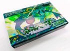
Japan’s boxart is SOO much better looking than any of the other regions by far!
Japan's boxart is SOO much better looking than any of the other regions by far! #Nintendo #Pokemon #retrogames pic.twitter.com/LMQ1DQCKCN
— MIDNITE (@ISITMIDNITE) August 21, 2023
by midnitefox
3 Comments
The horizontal box design just works better than the square ones in the West. Very similar to the original Famicom boxes.
They also (almost) never reuse the same logo design for the core title. Each generation adds its own flavour to it, while the western Pokémon logo has remained unchanged since its introduction almost three decades ago.
This boxart isn’t that different from other Pokemon boxarts. It’s just the render of a pokemon with a flat background, like in Blue/Red and Sword/Shield.
If the boxart was kinda like Arceus or something (showing a situation that represents the game), it would be cool, but that’s not the case here.