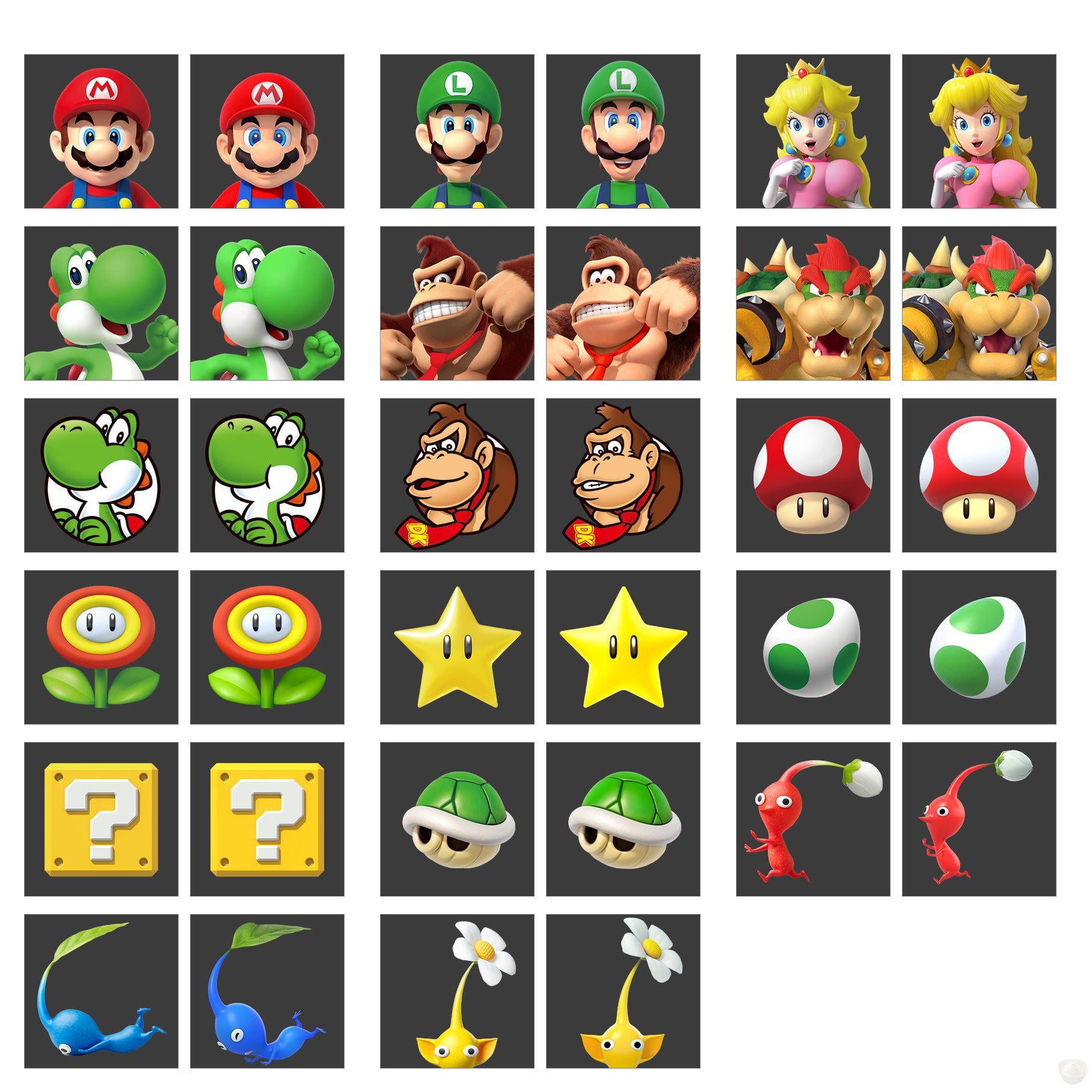
You can still use the old DK icon if you redeemed it when the DKC Returns HD icons were available.
I overall like the new style of the icons, they feel more colorful and alive.
velj_24
wow i really hadnt noticed that they still had old ass wii era renders on there.
it’s a good change, especially since this does seem like it is setting the table for the switch 2 to reuse the same system
Pale_Initiative2844
Pikmins got a straight downgrade. Shame
DJFid
Ruining DK in my opinion
Vibranium2222
Some of these redesigns seem arbitrary
incrediblejonas
blue pikmin continues to eat shit
Lewcaster
I don’t mind the new DK design, but they shouldn’t replace the older icon, I love using it because it reminds me of my childhood 🙁
2NE1Amiibo
Poor DK got him all buggy eyed.
cutememe
They really went and made sure Luigi looks friendlier. I wonder why…
RevealHoliday7735
my GOD Yoshi’s nose just keeps getting bigger!!!
theanthonyya
I know I’m in the minority but I don’t love DK’s new design. I actually like it less and less the more I see it.
It’s definitely more expressive, and it’s not bad by any means. But I feel like he looks more childish/immature/cute now, which in my opinion doesn’t really fit DK.
Oddish_Femboy
Pikmin look worse. :c
paige9413
The only one I don’t like is the red and yellow Pikmin. Love that they changed Luigi to smile more and the black around the iris’ for both brothers really makes the color pop.
Oddish_Femboy
I like that 2D Yoshi is a bit closer to the Mario World look. Always prefered how he looks in that game.
Manor002
I absolutely hate how they’re retconning Rare DK. I grew up with that design, makes me sad.
SockApart838
They made luigi smile. Literally unplayable now.
AMightyKong
I can see the differences in all of them except the Koopa shell.
Edit: Maybe they slightly rounded the bottom? Or that could just be the image.
Stanley--Nickels
Feels like everything got even brighter
Anthonyhasgame
Ok!!! I finally figured it out.
What bothers me about the DK render is the eye spacing. They’re the closest they’ve ever been; they’re now touching. And that combined with the more rounded brow arch is multiplying the issue to make DK look like a cyclops.
Look at the image from far away or a tiny version of the image. It’s now serving cyclops.
The drawing nails it though. Render needs another touch up.
Krait972
Not a big fan of the changes
ColorMeMac
DK looks so much worse.
-StarFox95-
gonna be honest the new DK looks bad lol
greaseman420
Fuck the old dk looks so badass
Crimzonchi
The Pikmin ones are a straight downgrade, they clearly have less rendering detail and polygons.
They went from 3D renders specifically made for promotional material, manually posed to give off a specific impression, to the in-engine assets used in the game, in the middle of the animation poses that prior renders were based on.
Biggest example is with the red pikmin, he was looking behind himself while running, like there’s something chasing him just off screen, now he’s just generically running forward.
26 Comments
why are they retconning Retro DK so much lol
DK reminds me of the regional Kirby cover thing…
You can still use the old DK icon if you redeemed it when the DKC Returns HD icons were available.
I overall like the new style of the icons, they feel more colorful and alive.
wow i really hadnt noticed that they still had old ass wii era renders on there.
it’s a good change, especially since this does seem like it is setting the table for the switch 2 to reuse the same system
Pikmins got a straight downgrade. Shame
Ruining DK in my opinion
Some of these redesigns seem arbitrary
blue pikmin continues to eat shit
I don’t mind the new DK design, but they shouldn’t replace the older icon, I love using it because it reminds me of my childhood 🙁
Poor DK got him all buggy eyed.
They really went and made sure Luigi looks friendlier. I wonder why…
my GOD Yoshi’s nose just keeps getting bigger!!!
I know I’m in the minority but I don’t love DK’s new design. I actually like it less and less the more I see it.
It’s definitely more expressive, and it’s not bad by any means. But I feel like he looks more childish/immature/cute now, which in my opinion doesn’t really fit DK.
Pikmin look worse. :c
The only one I don’t like is the red and yellow Pikmin. Love that they changed Luigi to smile more and the black around the iris’ for both brothers really makes the color pop.
I like that 2D Yoshi is a bit closer to the Mario World look. Always prefered how he looks in that game.
I absolutely hate how they’re retconning Rare DK. I grew up with that design, makes me sad.
They made luigi smile. Literally unplayable now.
I can see the differences in all of them except the Koopa shell.
Edit: Maybe they slightly rounded the bottom? Or that could just be the image.
Feels like everything got even brighter
Ok!!! I finally figured it out.
What bothers me about the DK render is the eye spacing. They’re the closest they’ve ever been; they’re now touching. And that combined with the more rounded brow arch is multiplying the issue to make DK look like a cyclops.
Look at the image from far away or a tiny version of the image. It’s now serving cyclops.
The drawing nails it though. Render needs another touch up.
Not a big fan of the changes
DK looks so much worse.
gonna be honest the new DK looks bad lol
Fuck the old dk looks so badass
The Pikmin ones are a straight downgrade, they clearly have less rendering detail and polygons.
They went from 3D renders specifically made for promotional material, manually posed to give off a specific impression, to the in-engine assets used in the game, in the middle of the animation poses that prior renders were based on.
Biggest example is with the red pikmin, he was looking behind himself while running, like there’s something chasing him just off screen, now he’s just generically running forward.