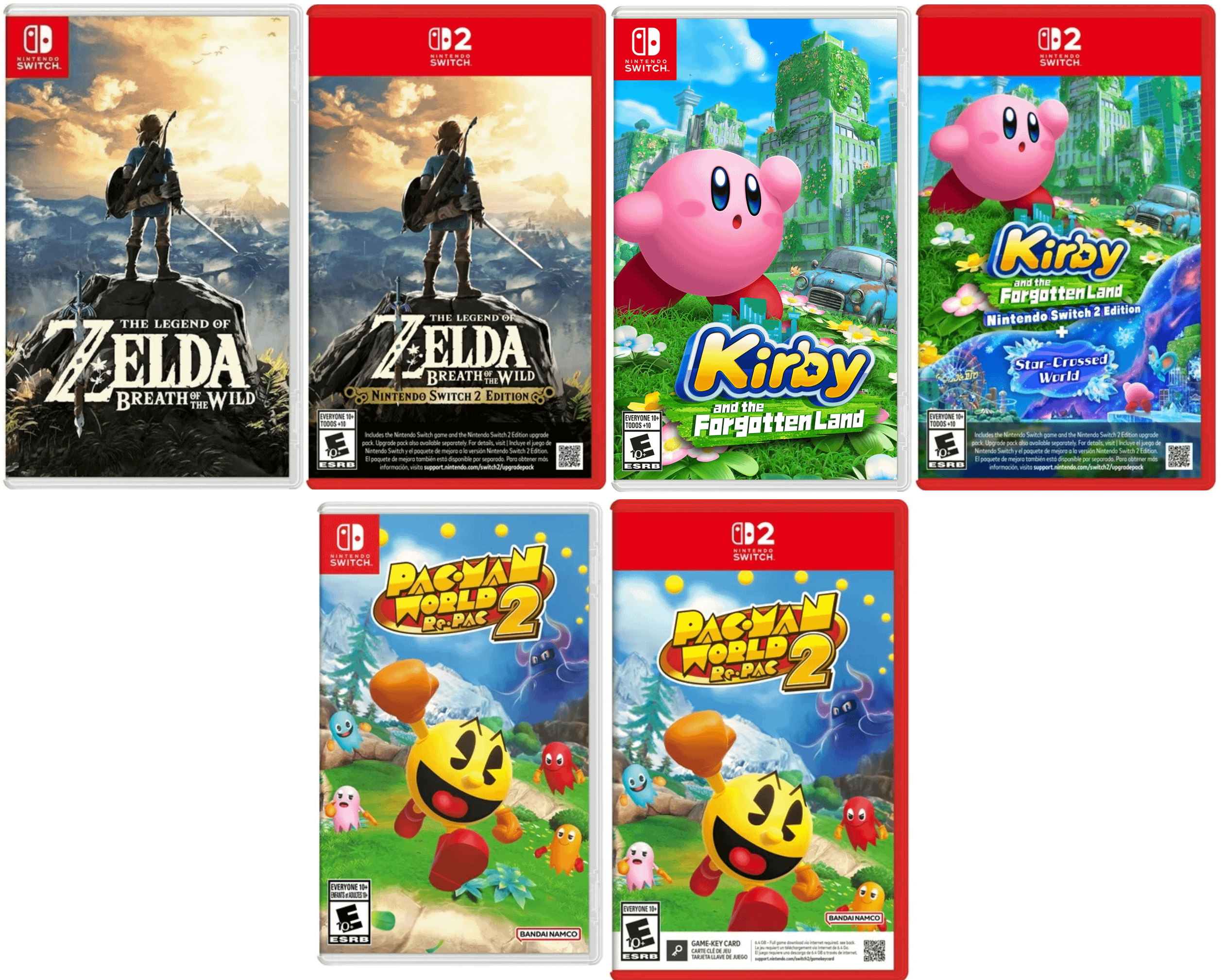
There are a ton of undeniable upgrades about the Switch 2 over its predecessor (e.g. more powerful NVIDIA chip, consistent 1080p display and 60 FPS, support for ray tracing and DLSS, etc). Overall it’s struck me as a more “premium” version of the Switch 1. However, I’m dumbfounded that Nintendo took a strong aesthetic that they had going with the Switch 1 game boxes and went out of their way to sabotage their own work. Who saw this and thought it looked like an upgrade?
While the original box design was minimalist and unobtrusive, which let the game art dominate the canvas (which is what it’s supposed to do), Nintendo decided that for the Switch 2 they would crop the artist’s work (which I imagine they had previously paid them handsomely to produce) to add giant red banners and clutter the image with extraneous text and QR codes. Watching Link stand dramatically atop a mountain and look down upon Hyrule as though he’s in a Caspar David Friedrich painting sells video games, not all of the clutter and rubbish that obscures the stuff that customers actually want to see. Some of these stylistic decisions are more mindboggling than the Ico JP à NA box art from 20+ years ago.
I’ve heard various arguments in favor of the next box art design. Usually it goes that these changes had to be made either to (1) differentiate the Switch 2 versions of the games from the Switch 1 versions or (2) they wanted to make the game boxes look like gigantic Switch 2 game cartridges because it’s cute, I guess. I agree that they need to look out for the consumer because there will be some confusion during this Switch 1 à Switch 2 transition due to the similar names of the consoles (e.g. as also took place with the Wii à Wii U, the manifold iterations of the 3DS, etc). However, Sony was able to produce 5 consoles with the exact same name minus a change in ordinal number, and they didn’t have to wreck their box art design in order to sell every new version of Call of Duty and Grand Theft Auto. Surely a multi-billion dollar corporation like Nintendo Co., Ltd has the resources to figure out a better way. If I was a more conspiracy theory-minded person, I would suspect that part of the motivation for this stylistic change was to decrease the desirability of collecting physical media (versus purchasing the games online).
Hopefully Nintendo will realize how attractive their original Switch 1 game box art was, and how much of a downgrade the Switch 2 versions are in comparison, and we’ll get some better-looking games going forward. Nintendo makes an excellent product and it's just shocking that they would seemingly cut corners with the box art.
by Switch_2_Enjoyer