- Talking about Hoothoot,
I love Hoothoot's design. The Spherical body is a typical shorthand for first stage Pokémon, it still clearly reads as an owl, and the subtle – yet not too subtle – stylization of its "brows" as clock hands gives it a fantastical element that ties it to the concept of time. Its red, wide open eyes give it the sense of a maniacal insomniac, someone who stays awake all night just to count the seconds as they tick by.
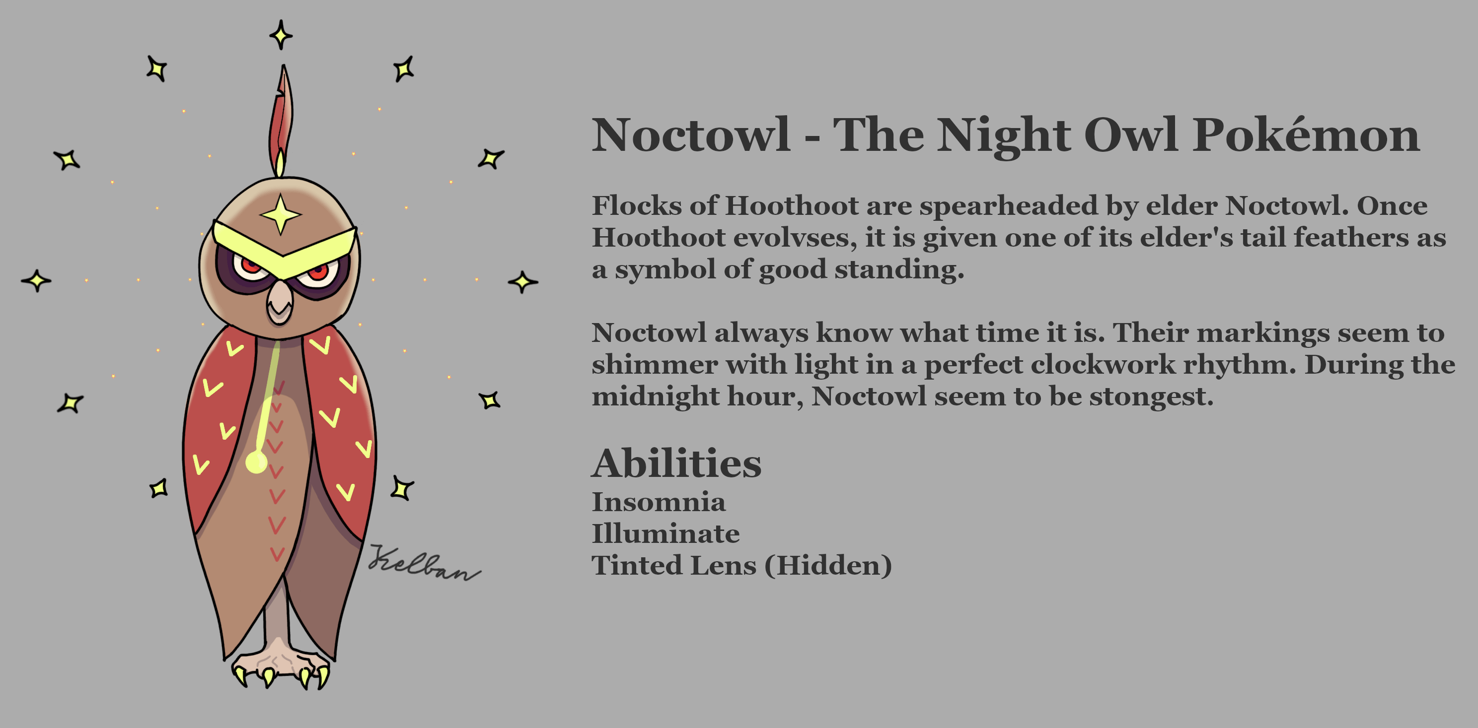
- Why Noctowl Fails,
Noctowl seems to entirely drop the stylized clock-hand brows and maniacal eyes. Where I would expect a progression that leans into the fantasy, Noctowl instead becomes more normal than its pre-evolution. Barely any fantastical features remain, it is now just an imposing-looking regular owl.
- What I kept,
I do still like that Noctowl is imposing, so I kept the basic shape of the eyes and beak. I also kept the base brown color, since there's no point in making Noctowl an entirely different base color.
- What I changed,
Basically everything else. I brought back the timekeeper-fantasy of Hoothoot, by giving Noctowl a 12-pointed Halo that resembles a clock. I wanted to signify "midnight", so instead of using the brows as the clock hands, I gave it a set of feathers, reminiscent of the symbols of status that some Native American tribes use. As an additional signifier of timekeeping, I gave it a chest marking that resembles the pendulum of a grandfather clock. Lastly, to progress out of Hoothoot's maniacal eyes, I tried to give Noctowl eye markings that look like huge shadows, signifying the long-term effects of chronic caffeinated insomnia.
EDIT Sorry for the typo in the title, can't edit the title unfortunately. Also fixed the text body formatting.
by kelb4n