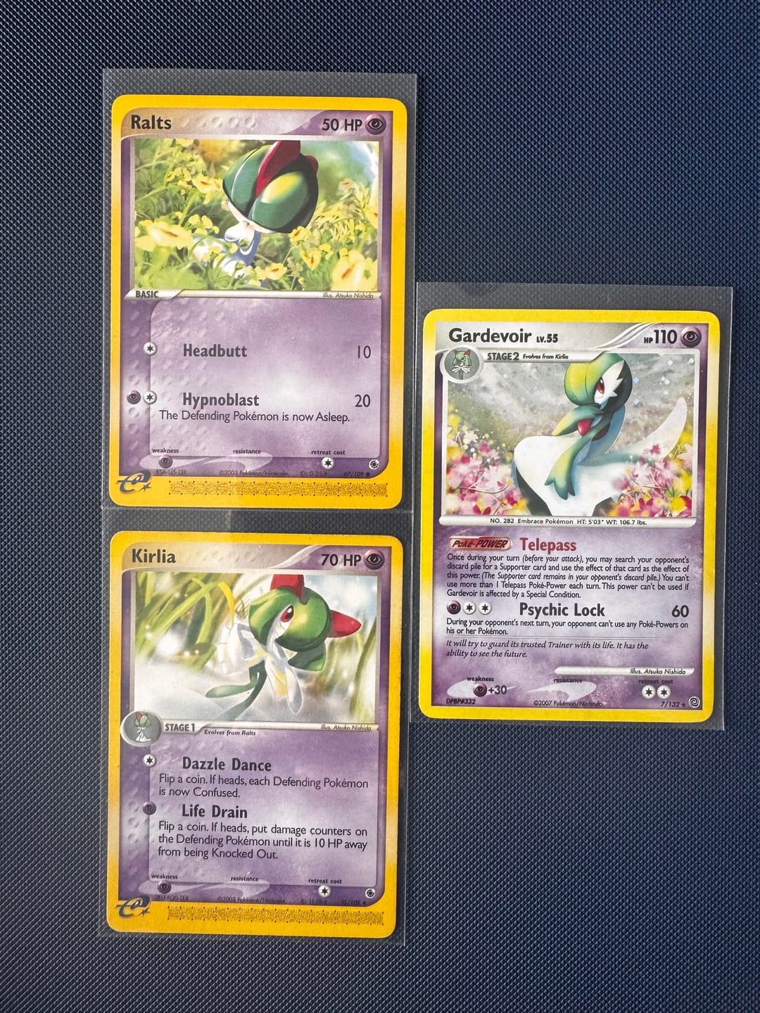
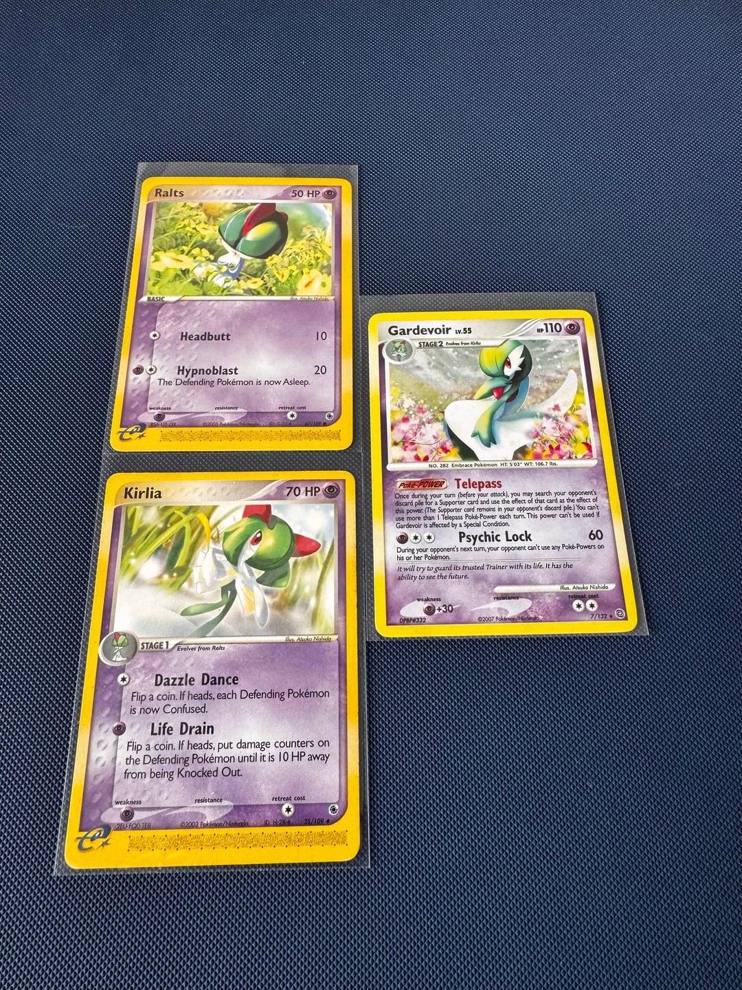
I don’t see this talked about very often, but I recently noticed something really cool about three older cards illustrated by Atsuko Nishida.
Most people know Nishida as the original designer of Illlustrator Pikachu, but she’s also done some really thoughtful evolution-line compositions over the years.
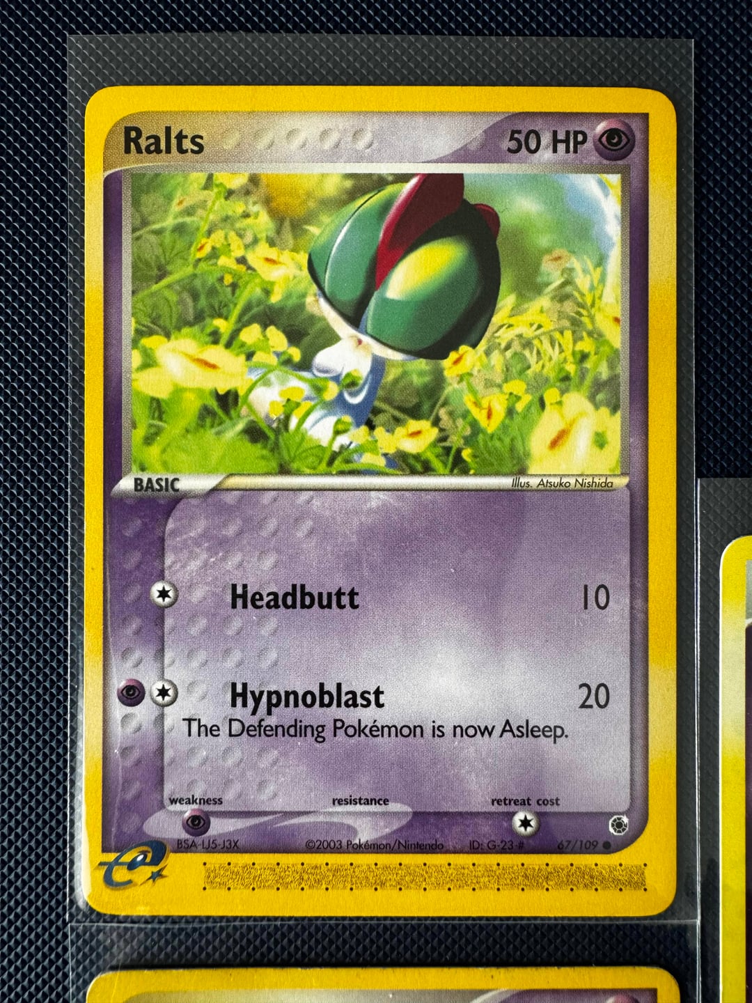
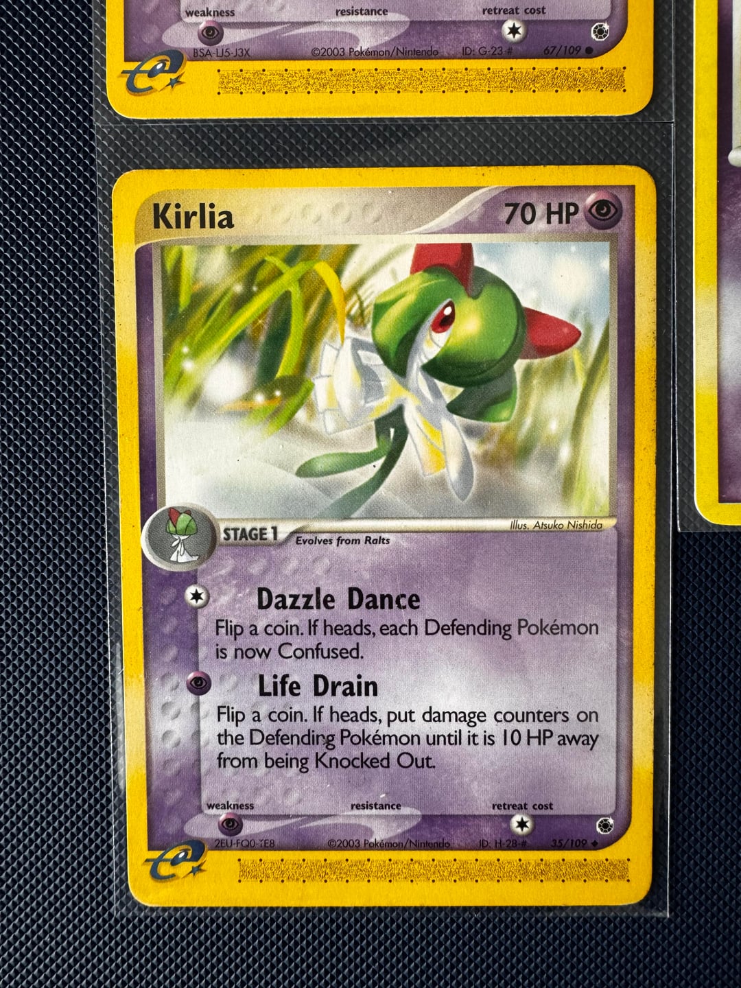
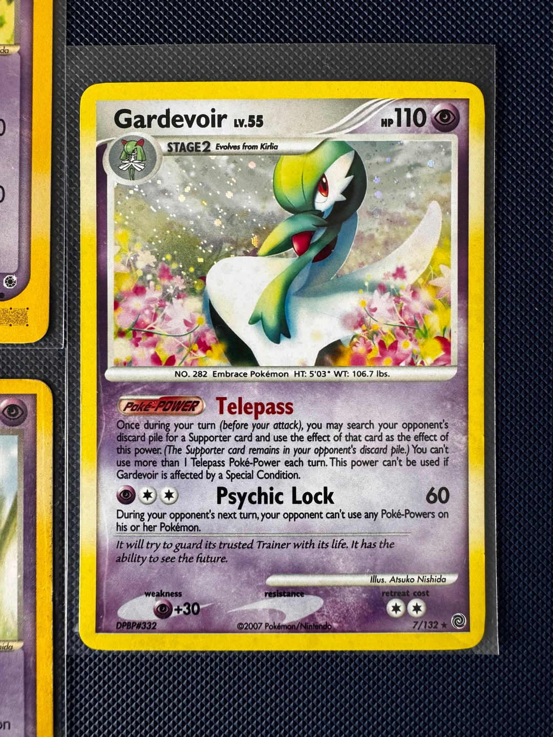
In Pokémon EX Ruby & Sapphire, she illustrated Ralts and Kirlia. Then later, in Pokémon Diamond & Pearl era, specifically Secret Wonders, she illustrated Gardevoir.
When you line the three cards up side-by-side, the environments and lighting feel intentionally continuous. Ralts is low in the grass, Kirlia rises slightly above the field, and Gardevoir stands fully composed in a luminous, almost ethereal extension of the same natural setting. The progression feels calm and narrative, not just mechanical evolution.
What I love about it:
- The consistent soft color palette
- The sense of vertical growth across the three stages
- The way Nishida gives each form a distinct personality while preserving atmosphere
It feels less like three separate card commissions and more like a quiet triptych that happened years apart.
I collect primarily for artwork, and I’ve been documenting little connections like this (using only cards I physically own, i.e. no stock images). If anyone else appreciates this kind of art-focused perspective on the TCG, I’ve been sharing more over on Instagram (https://www.instagram.com/hitokagetcg).
Would love to know, are there other lowkey evolution lines where the artwork feels intentionally continuous like this?
by kevinleewy