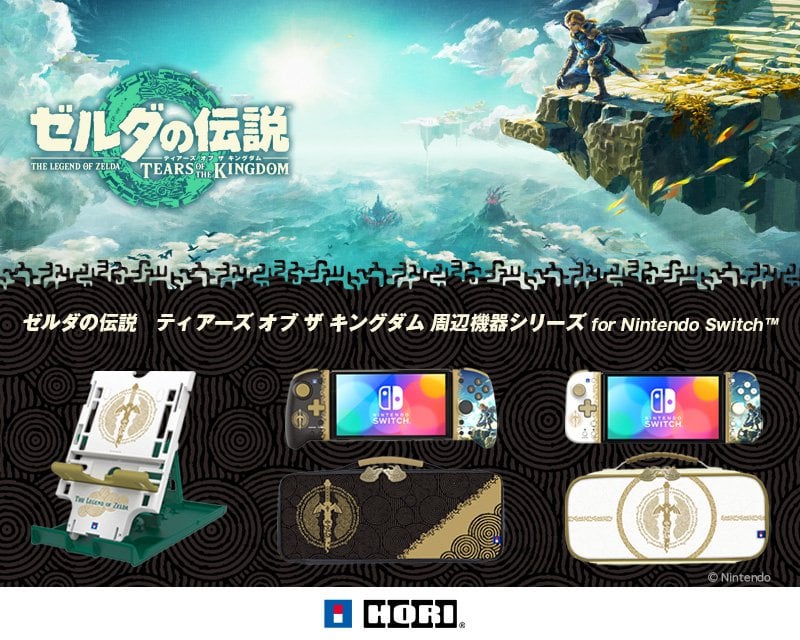
The Legend of Zelda: Tears of the Kingdom-themed accessories announced by HORI
The Legend of Zelda: Tears of the Kingdom-themed accessories announced by HORI
by spinzaku97
28 Comments
Glasskey117
The left joy con is nice on those at least
2hink
Meh
Khalmoon
They should have just stuck to the left hot on designs for both . Also the green is a little much for the stand. Probably should have been black/white gold
RandyMuscle
Not bad but could be a lot better
Uptopdownlowguy
It’s giving mid
rcandrasa
Mid
No-Strike-2015
I never really complain about design, but that right joycon is awful. Yikes.
BetaSoul
Those cases are likely going to be amazing. Almost regret my tomoc slim case.
ppbomber_0
Just make the same design on the right as the left and it’d be a lot better
Rizenstrom
The case is cool, but I think I’m sticking with the official one instead.
zacattack101
Designs are okay, but those big joy-cons are literal game changers for big handed people and handheld mode. Can vouch.
PageOthePaige
No rumble, no motion. Really sucks that they won’t let hori/powera make functional accessories.
qua2k
I will be sticking with the NexiGo Gripcon and case combo. The white stand is nice but I still have the black Zelda one. Decisions.
vragal
That right joy con… Choices.
xCaldy
Does amiibo works?
FoxxyRin
All I wanted was for a Zelda split pad pro from them only to be disappointed. I’m glad I snagged a pro controller but I was really hoping for something to replace my pikachu and eevee split pad.
GachiGachiFireBall
Never cared for any 3rd party accessories tbh. Even disregarding that these look mid af
Wildfire-Man
Why they used the cover Artwork on the joyon? I like the Art on the cover but dont need it anywhere else.
gear_red
I’d love it if their cases could fit the split pads.
jl_theprofessor
Fuuuuuuuuck my wallet.
jacobooooo
what the hell is that right joy-con😭 c’mon this is soo lazy.
delphicdeceit
I detest just slapping key art onto an accessory like the way the right split-pad cons are shown; even worse when it’s just a character on a background. The cases look neat though. If I used split-pad cons, I’d probably just substitute the right con shown here for a generic black one.
mjsxii
these are ugly af, like why cant themed merch be subtle and considered when being designed… I dont want the right side of the controller to just be a screen print of link 🤮
Jlchevz
They look nice
Voltron1551
Man that’s disappointing.
crescentgaia
I’m just here for the Sword case.
twinkletoes-rp
NGL, I think this stuff looks WAY better than the officials we got!
28 Comments
The left joy con is nice on those at least
Meh
They should have just stuck to the left hot on designs for both . Also the green is a little much for the stand. Probably should have been black/white gold
Not bad but could be a lot better
It’s giving mid
Mid
I never really complain about design, but that right joycon is awful. Yikes.
Those cases are likely going to be amazing. Almost regret my tomoc slim case.
Just make the same design on the right as the left and it’d be a lot better
The case is cool, but I think I’m sticking with the official one instead.
Designs are okay, but those big joy-cons are literal game changers for big handed people and handheld mode. Can vouch.
No rumble, no motion. Really sucks that they won’t let hori/powera make functional accessories.
I will be sticking with the NexiGo Gripcon and case combo. The white stand is nice but I still have the black Zelda one. Decisions.
That right joy con… Choices.
Does amiibo works?
All I wanted was for a Zelda split pad pro from them only to be disappointed. I’m glad I snagged a pro controller but I was really hoping for something to replace my pikachu and eevee split pad.
Never cared for any 3rd party accessories tbh. Even disregarding that these look mid af
Why they used the cover Artwork on the joyon? I like the Art on the cover but dont need it anywhere else.
I’d love it if their cases could fit the split pads.
Fuuuuuuuuck my wallet.
what the hell is that right joy-con😭 c’mon this is soo lazy.
I detest just slapping key art onto an accessory like the way the right split-pad cons are shown; even worse when it’s just a character on a background. The cases look neat though. If I used split-pad cons, I’d probably just substitute the right con shown here for a generic black one.
these are ugly af, like why cant themed merch be subtle and considered when being designed… I dont want the right side of the controller to just be a screen print of link 🤮
They look nice
Man that’s disappointing.
I’m just here for the Sword case.
NGL, I think this stuff looks WAY better than the officials we got!
Very whelming