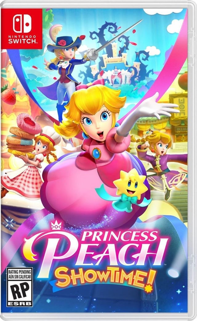
Was looking at a website and noticed Peach looked… angrier… from what I remember seeing in September. I scrolled through my photos and found my saved photo from the day they showed off the box art so I know I’m not crazy. Did anyone else notice this? I couldn’t find any info online about this
by Wire_Emblem
45 Comments
US Kirby’d
Here face looks similar to the movie version.
I can’t see any difference in the fencer.
I can tell the baker is somehow different, but I can’t quite articulate how.
The change in the martial artist’s expression makes sense to me.
But who thought it was a good idea to go all DIDNEY WORL with the central figure?
Peach has a weird face in the second photo
“American Kirby is Hardcore” in action.
I prefer the original but I can see why they would want to make her appearance look more like the movie interpretation.
the face looks uncanny to me for the new one
It’s the movie Peach, interesting
As others have said, it looks like she’s been made to look more like the movie version. The kirby treatment.
The new face on the right side is hilarious though.
The original looks way better IMO.
It looks like the same model with more dynamic expressions. I like it! Though, the expression on the Peach in the middle is a little odd
If there wasn’t a comparison I wouldn’t mind it as much.
the first one looks like mario party art where she would be holding the dice
Man I was really hoping the movie designs wouldn’t influence the games at all.
Actually liked Kungfu Peach’s new expression, but man her center art looks wayy off.
They’re trying make her look more like movie Peach, but did a very half-assed attempt at it.
It looks like the face was altered to resemble the Mario Bros Movie design more.
While i get the “she looks more like the movie” in the middle, i think the most obvious change (and reason for the adjustments) is that she now has more distinct expressions and faces in all of her 4 outfits on the cover.
Before it looked visually boring, because she basically had the same expression everywhere.
The old one had the bottom 3 characters all with basically the same expression. The new one has 4 different expressions, which I think is fitting for a game where the costume change leads to a change in character/personality. Good change.
Insomniac fans: Here we go again.
I like the secondary/background expressions. The middle one doesn’t work though, because the new expression tilts her face down with her head in the exact same position.
In the first one she’s looking head on, in the second she’s looking “up” at us but we don’t see more of the top of her head. I think that’s why it looks weird.
Same expression 3 times on the original. Makes sense to mix it up more on the new one
It’s so strange that she changed appearance on the cover when she looks like herself in the game
Slow news day huh?
Lol, some people in this comment section are WILD.
The changes are *so subtle* & people are now declaring it “ruined” and “terrible” and all manner of overreaction.
They just made her expression a bit more dynamic, calm down y’all. It’s not changed the game.
And it’s not like Nintendo hasn’t been subtly changing & tweaking the look of all the Mario characters for *decades*. They started out at as 8 bit figures for crying out loud!!
In the old one she had the same expression three times, she now looks more badass and with a personality.
Posts like these show how reactionary and ridiculous this sub can be most of the time. Even got the anti-woke mob rehashing their gripes about movie Peach again. It’s a smart subtle change, the renders in the old art looked too placeholder-y imo. You got Peach in a Gi doing karate kick, all of which is new to the character, but her face looks like it could be plugged into any other Mario spinoff. It lacks it’s own identity which doesn’t help a game that’s kinda been getting overshadowed by RPG remake and now Thousand Year Door. New, more dynamic renders shows consumers that this is something different to the Mario franchise, it has nothing to do with trying to capitalize off the freaking movie
main center peach looks better in the original but the kung fu fighter peach looks better in the new one tbh
How did you get “angrier” from the revised box art? I’d say she looks more focused/determined, not “angrier”.
Edit: OP was in fact talking about Kung Fu Peach, I’m assuming.
Super interesting… and well spotted! This looks more like a retouch from the Artist department than a difference of opinion between regional market departments. Peach is now closely resembling her movie counterpart too… which I think shows Nintendo is evolving.
A lot of people saying “She’s being made into Movie Peach” and I can see where they’re coming from, but to me it doesnt look exactly like that.
Instead, to me, it looks like on the original box art they realized she ALWAYS has the same doll-like expression and wanted to give her a bit more complexity in her facial expression. I mean, if they really WERE gonna make her like movie peach, why would sword peach and baker peach still have the same expressions?
The ones in the middle and the right, they don’t look like “movie peach” to me, not exactly. they look like “here’s the standard peach but emoting more”
Which, I think, is 100% a good thing. They’re letting themselves experiment with more than the standard plastic expressions that have been the standard since they moved to 3D. We all talk about how Nintendo should be more willing to fuck with their own standards, and I think this is an example of that.
Original: Peach only has one facial expression
New: Peach has varied facial expressions
I gotta disagree with y’all on this looking more like the movie version. I’m pretty sure what happened here was that audiences reacted strongly to Peach being aggressive in the trailer, so they’re playing that up in the marketing now.
What that means is a more “adventurous” expression, and they’ve increased the angle, giving it more shadow and sharper features. You can see this reflected on the material arts face too.
The movie version, meanwhile, is all about being round. You can use movie peach’s face as baby peach and wouldn’t have to change a thing. Very different vibes between this game and the movie.
Should’ve gone all the way and made her look pissed off as she was carrying those cakes too.
“Goddamn motherfuckin’ cakes all stacked up and shit who even needs this much sugar? Fuck em”
Y’all I don’t think they’re making her more like movie peach here – otherwise why would the bakery face and fencer face stay exactly the same?
I think they’re just making her more expressive, and because we’ve never seen Peach expressive her face looks super different, but it isn’t. They’re just giving her more emotion than we’ve seen before
I think it’s much better. Peach is so under-expressive in most Mario media, so she could use this.
I actually prefer the new art. I like that peach is allowed to have more than her usual expression and be dynamic with all the different outfits she wears in this. The first version just seemed like business as usual peach, bright/wide eyes and all. Now she looks like an action hero, determined and ready to go. It’s a good change for an action game.
She got Kirby’d.
Now US audiences will know SHE MEANS BUSINESS
It’s intentionally more aggressive looking. It’s not to make her look more like the movie, but in the spirit of the movie, Nintendo wants her to look like a daring hero, and not a demure princess.
The new Kung Fu Peach face is fun/more emotive. Main face is… blah. Just looks off. I get it’s more like the movie, but I think the angle might make it get closer to uncanny valley.
Definitely prefer the original.
Don’t like the change to the central pose.
I dont like it! She looks super cute in the OG
I like what the did with the kung fu expression, but the center peach looks off
I really like the change to her Kung-Fu render, but the middle one just looks off. It looks sort of like movie peach, which isn’t inherently bad but it doesn’t fit with the other renders on the cover to me. All other outfits use something more akin to her video game design. I like that she’s more expressive, but it just doesn’t look right. Maybe it has something to do with the more pronounced nose and cheek shading?
They Kirby’d it.
Anime vs Netflix adaptation