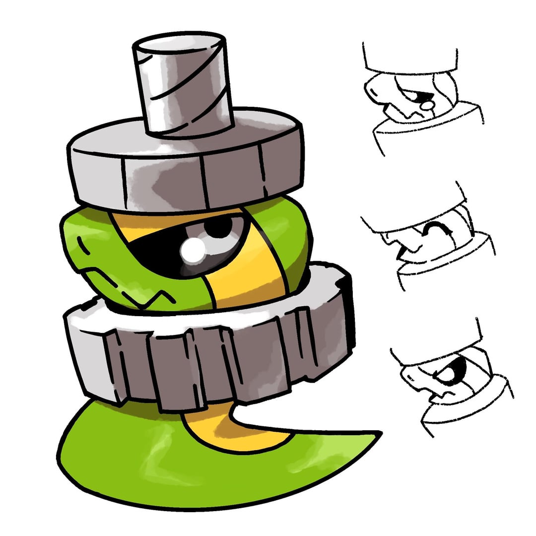
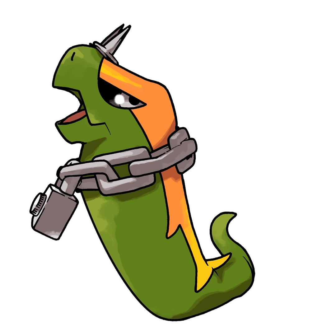
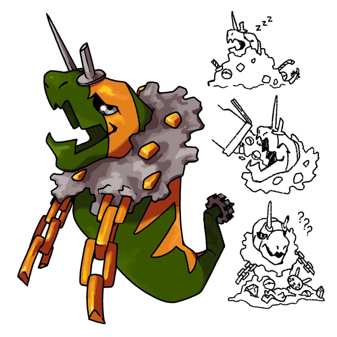
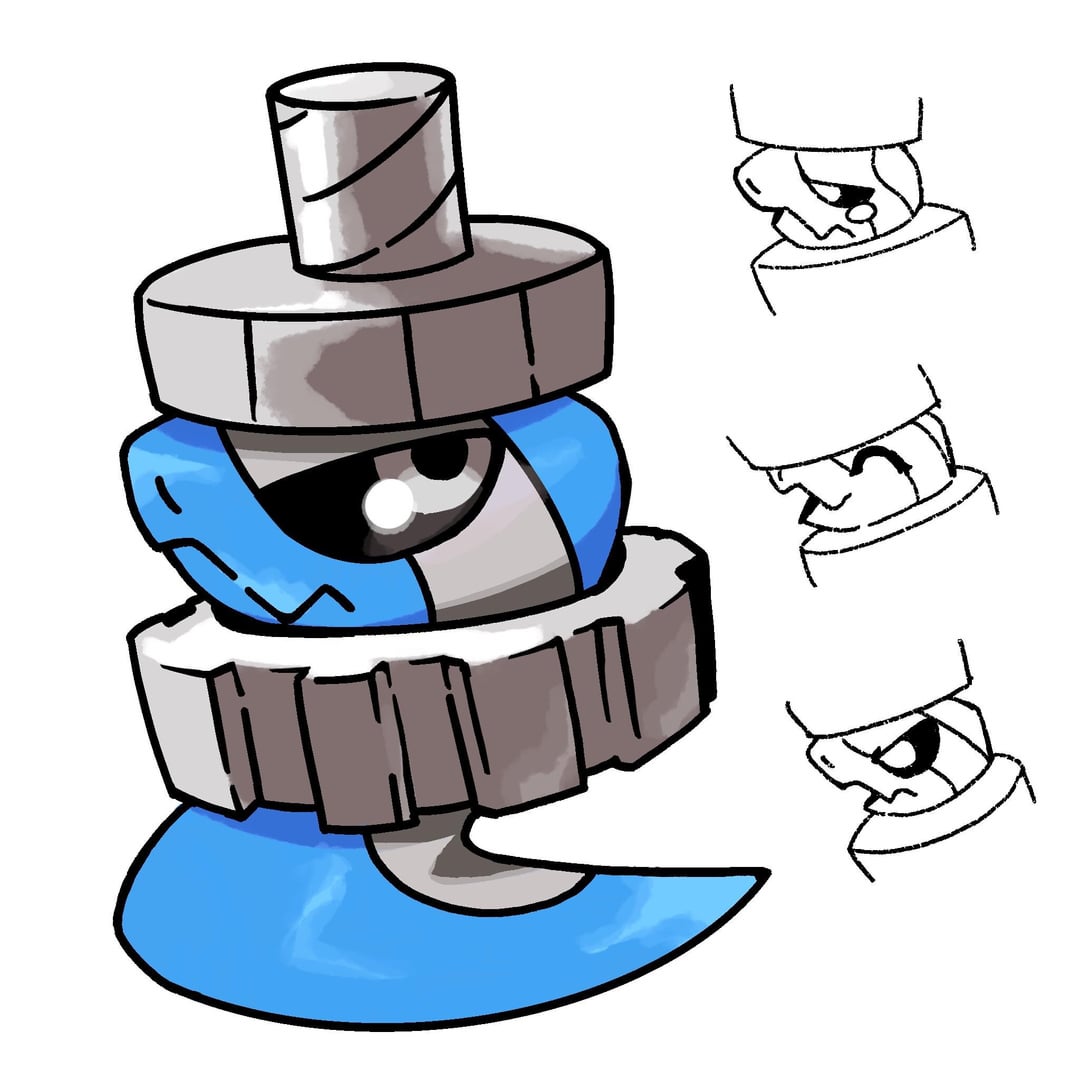
I redesigned my Grass starter line (First is the newest design)
I redesigned my Grass starter line (First is the newest design)
by DragunFlyx
13 Comments
Famous-Register-2814
I love the last 3
Yellow_rat_residue
Interesting redesign, though I’m a bigger fan of the previous one.
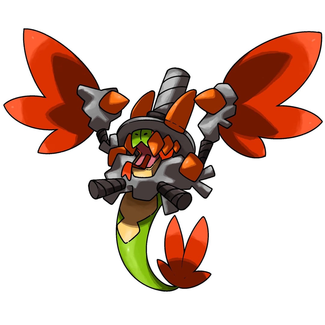
The shape language, colors, and overall direction of a Quetzalcoatl made of loose screws and metal bits makes it more interesting to look at in my opinion
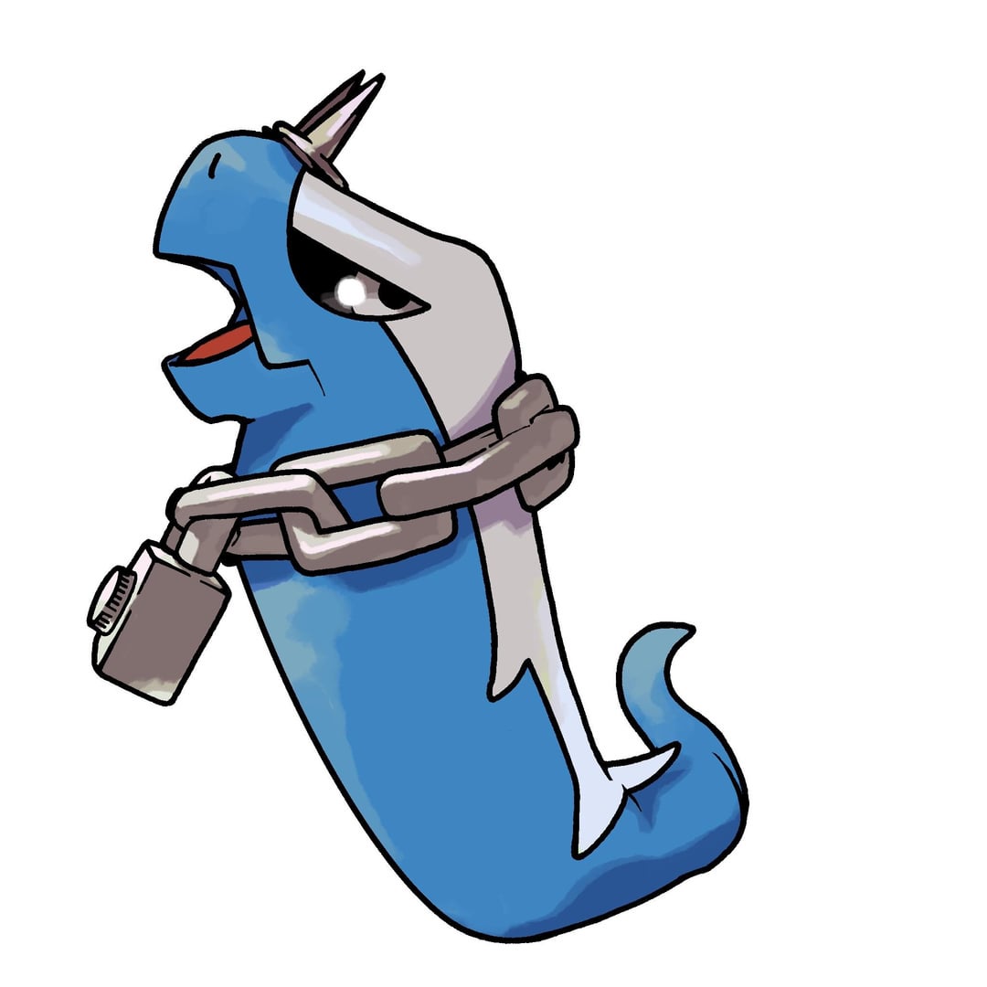
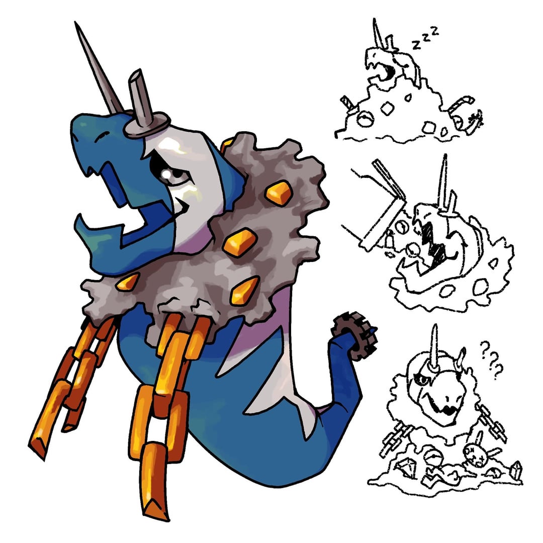
That’s not to say that there’s nothing I don’t like from the redesigns. I really do like the first stage. And I like how you turned the trash around neck of the previous second stage Pokémon into a chain necklace. By the final stage, however, I feel like something is missing. Maybe it’s the shapes that was lost with its wings.
Furthermore, I think the rendering style on the latest redesign is stronger than it was before (stronger line work, heavier emphasis on values, and is more similar to the sugimori art style but with its own unique flair)
Overall, though, I think there are elements from both the redesigns and the previous designs that could be fused together to create something a lot more visually striking and more akin to a starter pokemon
ChefCool1317
2nd and 3rd look nearly identical 3 is just 2 but slightly bigger and a extra nail. If that’s supposed to be an evolution then I would play with the design more
Alex20041509
Very cool but steel grass? 4x weakness against fire
kp012202
He’s just…bigger.
Frequent_Kale9709
I like the old design its looks like a starter Pokémon
Elliot-Robot
You made him so much worse, the old design actually has charm and changes with every evolution instead of just getting bigger
los_stupidos96
I prefer the previous one because of that screw top hat
gimplegumblus
It doesn’t look like a grass type though
Mooselord111
I don’t know why, but I instantly thought of the worm dogs guards from that one episode of SpongeBob, where they had to get Mr. Krabs money mattress
Ham_is_tasty_1
old one was better
UWan2fight
I like the first stage, but the rest is just… meh. He just gets bigger. It doesn’t feel like it changes enough to be a starter. If you cut out the middle form this would feel like an ok two stage pokemon.
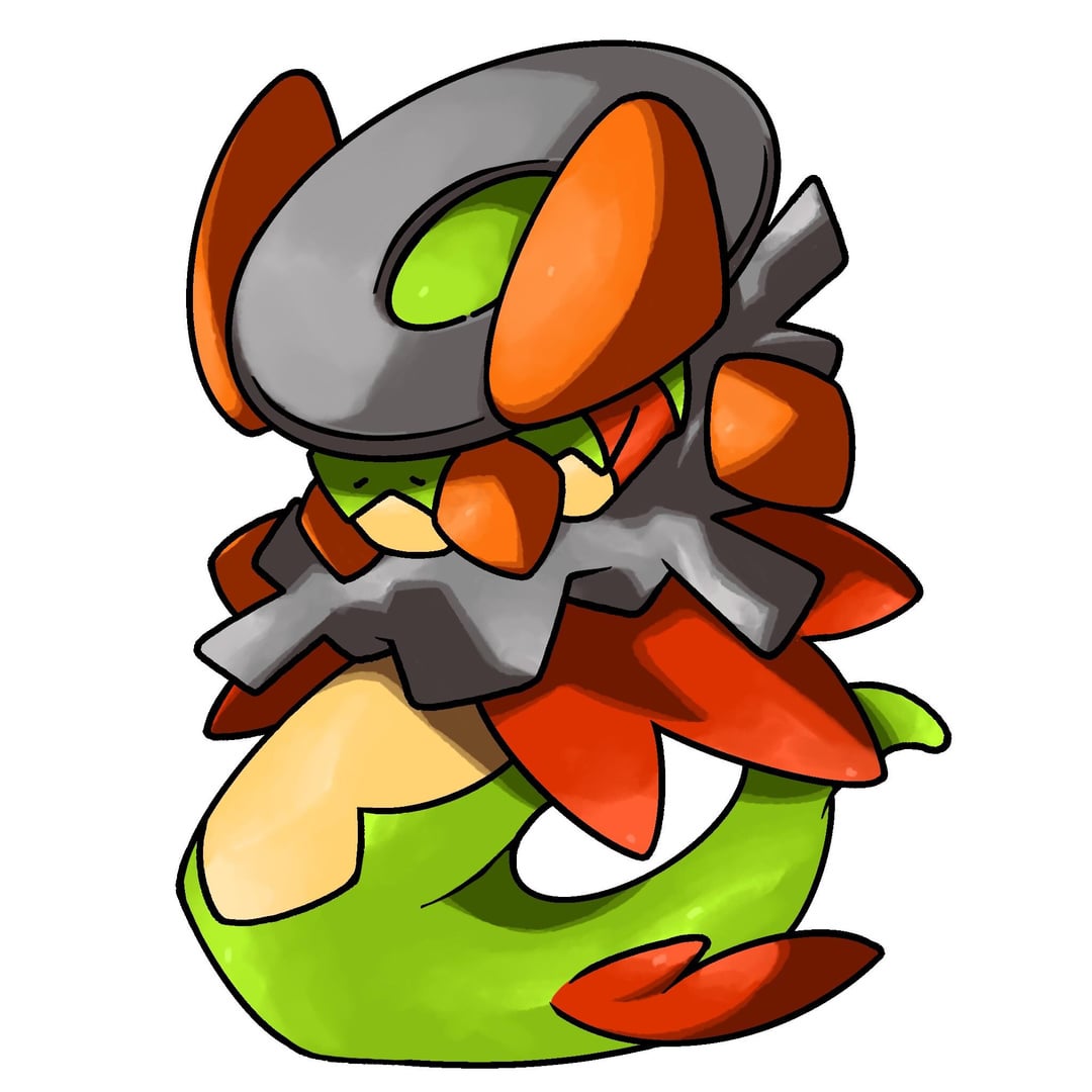
The third stage especially is so… boring for a starter pokemon. It’s a fat snake with a metal mane.
Second stage as well feels like a placeholder. The proportion of the too-fat, nearly cylindrical upper body and the tiny lower body, with the only detail it has being a chain necklace and the two tiny horns just looks weird to me.
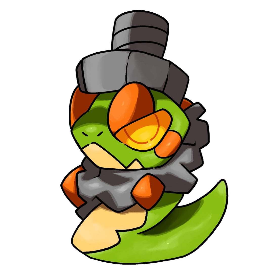
I love the first stage though. Tiny little snake with a metal screw hat thing. It looks adorable.
Sorry for being kind of an ass about this.
Lanky-Ad-3313
The middle stage just looks so boring imo. I think there needs to be more to show it’s a metal type. And then the third stage is like if metapod evolved into bigger metapod. It’s like a weird slug thing that just kinda looks boring. In my opinion you could keep the first stage but then take the second stage from your first design. For third stage I would just redesign. This is all my opinion though, do whatever you like the most lol.
13 Comments
I love the last 3
Interesting redesign, though I’m a bigger fan of the previous one.
The shape language, colors, and overall direction of a Quetzalcoatl made of loose screws and metal bits makes it more interesting to look at in my opinion
That’s not to say that there’s nothing I don’t like from the redesigns. I really do like the first stage. And I like how you turned the trash around neck of the previous second stage Pokémon into a chain necklace. By the final stage, however, I feel like something is missing. Maybe it’s the shapes that was lost with its wings.
Furthermore, I think the rendering style on the latest redesign is stronger than it was before (stronger line work, heavier emphasis on values, and is more similar to the sugimori art style but with its own unique flair)
Overall, though, I think there are elements from both the redesigns and the previous designs that could be fused together to create something a lot more visually striking and more akin to a starter pokemon
2nd and 3rd look nearly identical 3 is just 2 but slightly bigger and a extra nail. If that’s supposed to be an evolution then I would play with the design more
Very cool but steel grass? 4x weakness against fire
He’s just…bigger.
I like the old design its looks like a starter Pokémon
You made him so much worse, the old design actually has charm and changes with every evolution instead of just getting bigger
I prefer the previous one because of that screw top hat
It doesn’t look like a grass type though
I don’t know why, but I instantly thought of the worm dogs guards from that one episode of SpongeBob, where they had to get Mr. Krabs money mattress
old one was better
I like the first stage, but the rest is just… meh. He just gets bigger. It doesn’t feel like it changes enough to be a starter. If you cut out the middle form this would feel like an ok two stage pokemon.
The third stage especially is so… boring for a starter pokemon. It’s a fat snake with a metal mane.
Second stage as well feels like a placeholder. The proportion of the too-fat, nearly cylindrical upper body and the tiny lower body, with the only detail it has being a chain necklace and the two tiny horns just looks weird to me.
I love the first stage though. Tiny little snake with a metal screw hat thing. It looks adorable.
Sorry for being kind of an ass about this.
The middle stage just looks so boring imo. I think there needs to be more to show it’s a metal type. And then the third stage is like if metapod evolved into bigger metapod. It’s like a weird slug thing that just kinda looks boring. In my opinion you could keep the first stage but then take the second stage from your first design. For third stage I would just redesign. This is all my opinion though, do whatever you like the most lol.