Game covers IRL look much better
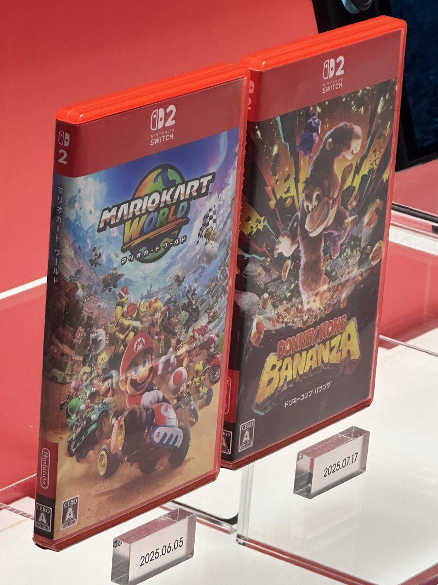
I’ve spotted this picture by @MrSheika on X (https://x.com/mrsheika/status/1908434916502646916?s=46) apparently from the Nintendo Museum in Kyoto. The game cover art extends to the side of the case as well, it looks so much better than the renders imo.
by G5u5
39 Comments
They absolutely do. The online renders looked terrible, and the red banner at the top was huge. I like these.
I also really like that the artwork wraps around the spine. Shout out to r/switchspines who have been doing art spines before it was cool.
Okay I like them
Happy the spines have art again.
Oh wow yea that’s not as bad tbh
Okay, they do actually seem better like this. I don’t know what’s going on with the online renders because they look horrendous. Although, I’d still argue I’d like the plastic to be translucent white and not red.
Looks better like that
ONLY if the PRICES looked this better too
Wow this is much better
Better but still not great honestly
The red bar at the top should be thinner and the switch 2 logo should be horizontal instead of the small square version
I can’t wait for the updated Scott the Woz video going over this and the 2 other times Xbox changed their damn covers lol
I’m gonna miss the aesthetic consistency of the red spines but I’m down with spine art coming back. Still think they should’ve kept the square icon in the corner to show more of the art
Are they the same size as switch 1 cases?
I’m actually really happy about the spines being bigger and more varied per game!
I personally love the red boxes. Much better than the clear
I do wonder if these boxes will include tabs for manuals that will never get used
I don’t like the red bar. I’m also sad that the spines aren’t neat anymore. To me that was always a nice detail of which allowed your collection to look uniform.
I wonder if this will be universal.
Game covers have a tendency to look different depending where you live.
Oh hey, it’s mario kart ZA WAAAARUDO!!!
I had a feeling this would be the… case
Oh my god Mario Kart World I need you my precious
Looks better but I’d still prefer no red banner up top. Ultimately it’s the last thing I’m worried about with Switch 2 though
Looks so good. Like a red velvet book omg.
Spine art we’re so back I’m so happy
To me it’s the “Switch 2 Edition” of older games that are ugly with their huge disclaimers at the bottom.
Honestly i still hate them its better than the online renders though
Why do you need such giant cases for such tiny cards? It’s such a ridiculous amount of waste.
Wow those are an improvement, especially with the art extending to the spine!
I love the spine art. And I love the artwork for donkey Kong. Looks very aggressive and I think that will appeal to a lot of people.
Ngl, wasn’t sold on the giant red banner before, but they look good here. I think it helps that they’re a darker shade of red then the case
Why the box need to be so big, even thought the game card is so small?
Is the size the same as the switch 1 cases?
why are they still so big? so much wasted plastic and for what?
I generally don’t think it’s that bad
I hated the online renders but these may be better than switch one to me.
I love the red case, I hate the big red strip at the top
How am I going to tell the difference between a Switch 2 game and New Super Mario Bros. Wii on my bookshelf though?
I bet even with the price increase, they still lack the game manuals.
Why don’t they make the cases the same size as the DS or Vita cases since it’s just a memory card?
Maybe they could lower the price if they stopped using the over sized case for a tiny cartridge and no manual 😭😭
Oh okay $90 is fine then