I just noticed this, and it bothers me way more than it should.
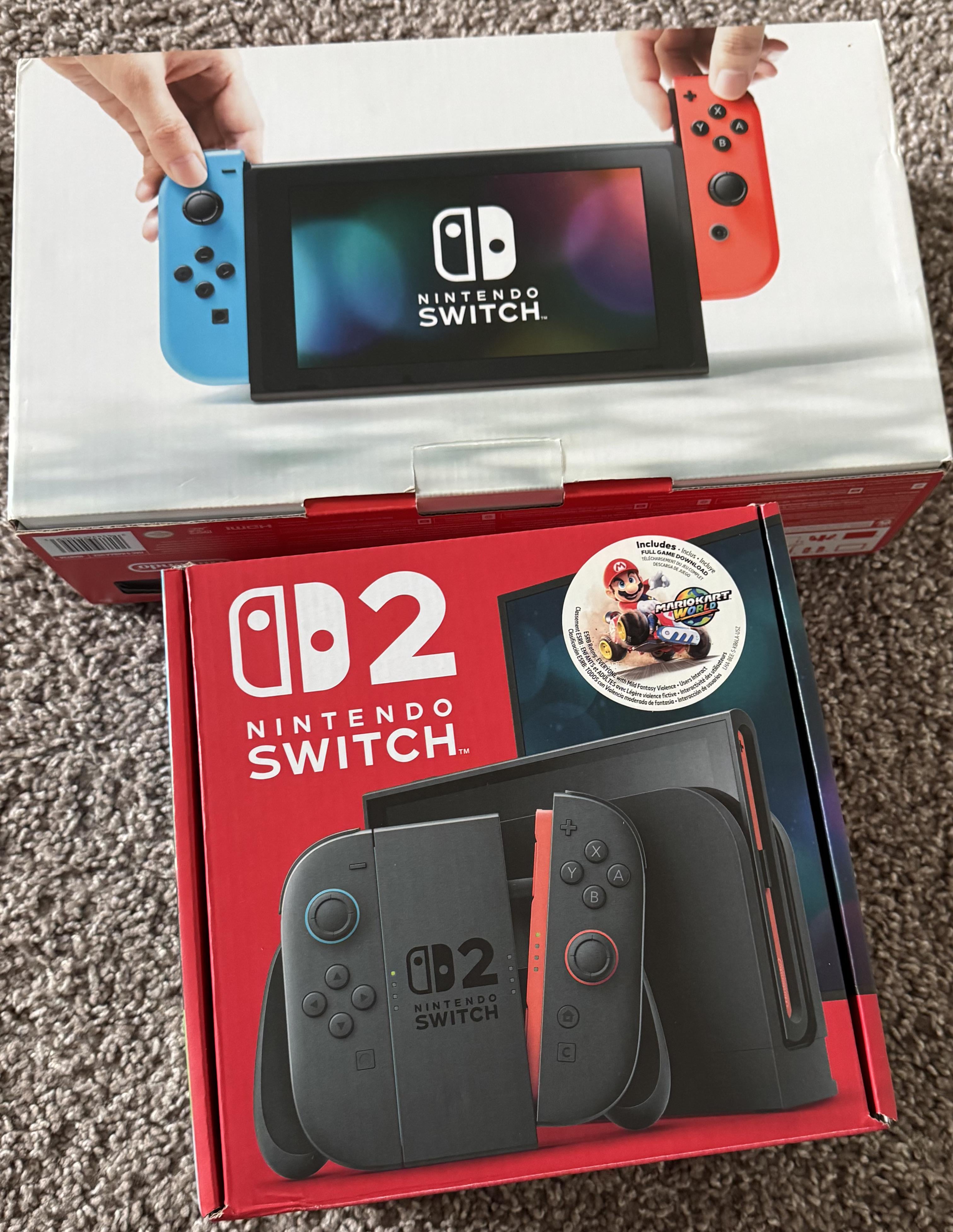
The Switch 1’s Joycons are a slightly different shape than the Switch 2’s. The original Joycons curve 90° along the corners, and then continue on for a bit after finishing the curve, making parallel lines along the top and bottom; meanwhile, the Joycons 2 curve 90°, then almost immediately stop (there is almost no part of the Joycons 2 where the top and bottom of each face each other in parallel). Proportionally, the Switch 2 Joycons are much narrower for their height compared to the originals.
Looking to the logo for both consoles, you can see that the logo for the Switch 2 is identical to the logo for the Switch 1. This means that the Switch 2 logo is in the shape of the Switch 1 Joycons rather than the Switch 2 Joycons. The Console’s Logo literally depicts an entirely separate system than the one it is supposed to represent.
They probably made the decision to not change the logo for brand recognition or because it wouldn’t be as aesthetically pleasing if they used the actual shape of the Switch 2’s Joycons. But I find it a bit frustrating that all the devices in the Switch 2 line feature logo that depicts the wrong device.
by ChoPT