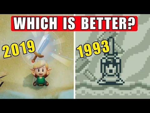
My boyfriend is making a full retrospective on Link's Awakening, but he recently beat the game and really wanted to talk about it, even before the video is finished, so voilà!
by Moment_of_Tangency
8 Comments
Jahon_Dony
He missed one.
Hitmonjeff
Cool, as far as looks go the Switch version is an amazing reimagining of the original game. Plays just like you expect it to.
Growing up Links Awakening was what got me into Zelda games so the original and DX versions are very dear to me.
StatementCareful522
hard to beat nostalgia but I have to give it to the remake after the Switch 2 framerate and res boost
MAXHEADR0OM
The switch version is one of my favorite games of all time.
DiddyKongDude
I still need to play this
FanSince84
This is probably the only game of its sort that I’ve ever been torn about in this way. Usually I’m super into remakes and reimaginings, as they don’t supplant the original and I can enjoy them for what they are and as new takes on beloved classics. And I think the Link’s Awakening remake’s art style is beautiful.
But for some reason, and only with this game specifically, my memory of playing it on my Gameboy Pocket is so entrenched in my mind, that I just can’t feel the same sense of nostalgia or magic in the remake as I do with the original. Even the Gameboy Color version somehow doesn’t quite hit the same for me.
I’m normally not like this, but solely for Link’s Awakening, for whatever reason, I just apparently need that old monochromatic look to feel the feels lol.
Dreyfus2006
Definitely LA DX and it’s not even close.
I was just playing the demo for Mina the Hallower (coming out later this year), and the game uses a very similar graphical style to LA DX. All I could think about was how good it looks. I love that they leave things to interpretation and let your mind run wild (OoT also does this very well). It’s very abstract, which helps support the surreal aspect of LA.
For example, I love love loved in Mina the Hallower when you see these mouse guards running around, and it is a little hard to make out exactly what their faces are like. And then you find one you can talk to, and their dialogue portrait is shrouded in shadow but what you can make out is pretty unsettling. These games only tell you the basic things you need to know, and leave the rest for your mind to run wild!
The HD version is very literalist, and what you see is what you get. And what we get is not something that fits the dark, moody tone of the game. I was so disappointed every time I visited an NPC thinking, “What are they going to make him look like in 3D?” only to find that they made the character look exactly like a literal interpretation of the sprite. There was no creativity whatsoever and they left no room for creativity on the part of the player.
starfishpup
I played the HD version. It’s adorable toy-aesthetic brings me great joy
8 Comments
He missed one.
Cool, as far as looks go the Switch version is an amazing reimagining of the original game. Plays just like you expect it to.
Growing up Links Awakening was what got me into Zelda games so the original and DX versions are very dear to me.
hard to beat nostalgia but I have to give it to the remake after the Switch 2 framerate and res boost
The switch version is one of my favorite games of all time.
I still need to play this
This is probably the only game of its sort that I’ve ever been torn about in this way. Usually I’m super into remakes and reimaginings, as they don’t supplant the original and I can enjoy them for what they are and as new takes on beloved classics. And I think the Link’s Awakening remake’s art style is beautiful.
But for some reason, and only with this game specifically, my memory of playing it on my Gameboy Pocket is so entrenched in my mind, that I just can’t feel the same sense of nostalgia or magic in the remake as I do with the original. Even the Gameboy Color version somehow doesn’t quite hit the same for me.
I’m normally not like this, but solely for Link’s Awakening, for whatever reason, I just apparently need that old monochromatic look to feel the feels lol.
Definitely LA DX and it’s not even close.
I was just playing the demo for Mina the Hallower (coming out later this year), and the game uses a very similar graphical style to LA DX. All I could think about was how good it looks. I love that they leave things to interpretation and let your mind run wild (OoT also does this very well). It’s very abstract, which helps support the surreal aspect of LA.
For example, I love love loved in Mina the Hallower when you see these mouse guards running around, and it is a little hard to make out exactly what their faces are like. And then you find one you can talk to, and their dialogue portrait is shrouded in shadow but what you can make out is pretty unsettling. These games only tell you the basic things you need to know, and leave the rest for your mind to run wild!
The HD version is very literalist, and what you see is what you get. And what we get is not something that fits the dark, moody tone of the game. I was so disappointed every time I visited an NPC thinking, “What are they going to make him look like in 3D?” only to find that they made the character look exactly like a literal interpretation of the sprite. There was no creativity whatsoever and they left no room for creativity on the part of the player.
I played the HD version. It’s adorable toy-aesthetic brings me great joy