I’m gonna be real I thought this was a Megaten demon. I might be stupid
Adam_The_Chao
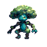
Not sure about colours, but I do feel like it’s overall too detailed for a gen 5 sprite (or any Pokémon sprites really). I’d say to simplify the lighting and maybe use some more black outlines.
KRLW890
It gives the impression of a 3D model that’s been run through a pixel filter. It looks good, but it’s not in line with the Pokémon style. Generally, every part of the sprite should have a darker outline except in very rare cases (and those are kind of “know the rules before you break them” scenarios). Parts more in the light will generally have lighter outlines, but always darker than the part it’s immediately outlining. Pokémon front sprites also have the lighting come from the top left of the image, where the character is facing.
You also are probably going above the color limit; Pokémon sprites traditionally only support 15 different colors. While Essentials doesn’t have this limitation, it’s good to stick to when possible just to better emulate the style.
MrEmptySet
Due to the compression it’s hard to tell just how many colors you have, but unless you have a lot of different but very similar colors it looks like you’re maybe close to the limit of what sprites tend to have, maybe a bit over. But it’s hard to tell, since the compression makes it hard to judge where you actually did use different colors versus where different colors were introduced by the compression algorithm. It would help if you could post an uncompressed and lossless version of the sprite somewhere. Sprites typically max out at 15 colors + transparency, so you can use that as a guide.
Rather than the number of colors, the stylization is quite a bit different from the Pokemon style. Pokemon sprites are typically lit from the front whereas yours is more lit from the side, and the shading in Pokemon sprites tends to be stylized in a somewhat flatter way whereas your sprite has a lot of depth to the shading and a lot of areas in shadow/darkness. It’s hard to make out the outline on your sprite due to the black background but it looks like you’re using the same dark indigo outline color throughout most of the sprite, whereas Pokemon sprites use varied outline colors matching the material being outlined or else black outlines for areas more in shadow.
Necro_Mantis
Too detailed and paintingesque. That said, it’s very pretty.
bbaahhaammuutt
Too detailed for gen 5 but i love it, if we got a pixel like game today that’s how i would want it
6 Comments
I’m gonna be real I thought this was a Megaten demon. I might be stupid
Not sure about colours, but I do feel like it’s overall too detailed for a gen 5 sprite (or any Pokémon sprites really). I’d say to simplify the lighting and maybe use some more black outlines.
It gives the impression of a 3D model that’s been run through a pixel filter. It looks good, but it’s not in line with the Pokémon style. Generally, every part of the sprite should have a darker outline except in very rare cases (and those are kind of “know the rules before you break them” scenarios). Parts more in the light will generally have lighter outlines, but always darker than the part it’s immediately outlining. Pokémon front sprites also have the lighting come from the top left of the image, where the character is facing.
You also are probably going above the color limit; Pokémon sprites traditionally only support 15 different colors. While Essentials doesn’t have this limitation, it’s good to stick to when possible just to better emulate the style.
Due to the compression it’s hard to tell just how many colors you have, but unless you have a lot of different but very similar colors it looks like you’re maybe close to the limit of what sprites tend to have, maybe a bit over. But it’s hard to tell, since the compression makes it hard to judge where you actually did use different colors versus where different colors were introduced by the compression algorithm. It would help if you could post an uncompressed and lossless version of the sprite somewhere. Sprites typically max out at 15 colors + transparency, so you can use that as a guide.
Rather than the number of colors, the stylization is quite a bit different from the Pokemon style. Pokemon sprites are typically lit from the front whereas yours is more lit from the side, and the shading in Pokemon sprites tends to be stylized in a somewhat flatter way whereas your sprite has a lot of depth to the shading and a lot of areas in shadow/darkness. It’s hard to make out the outline on your sprite due to the black background but it looks like you’re using the same dark indigo outline color throughout most of the sprite, whereas Pokemon sprites use varied outline colors matching the material being outlined or else black outlines for areas more in shadow.
Too detailed and paintingesque. That said, it’s very pretty.
Too detailed for gen 5 but i love it, if we got a pixel like game today that’s how i would want it