If you want to criticize, please give actionable advice. Thanks.
by FactorCalm9915
15 Comments
[deleted]
[removed]
Whitealroker1
Actionable Advice: MY EYES! THE GOGGLES DO NOTHING!
TemporaryLanky5496
Actionable advice: employees must wash hands before returning to work
Other_Service1158
Actionable advice: there’s a time and place for everything, but not now
SunshineAlways
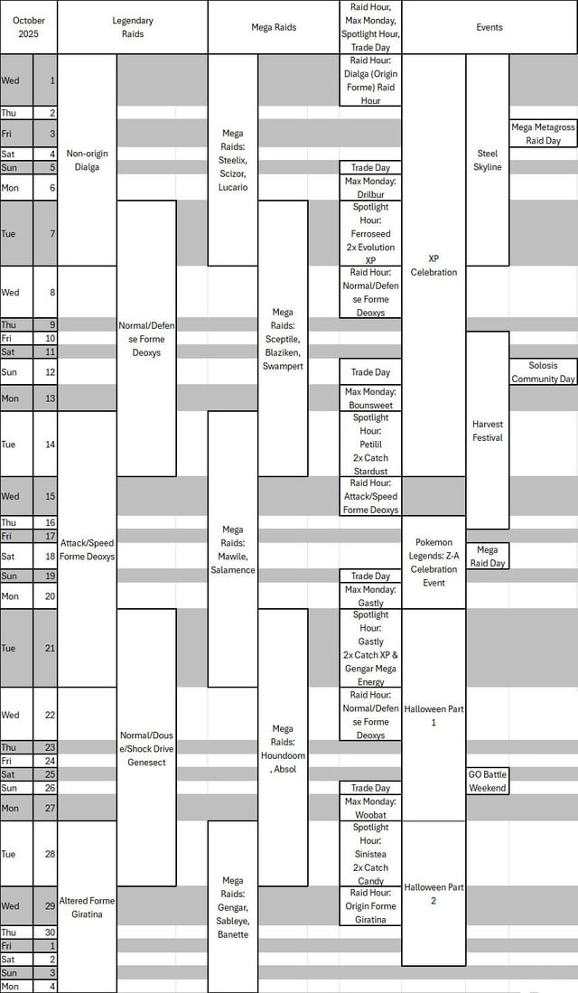
It’s not pretty, but it is clear and easy to understand.
ayooshq
There are unnecessary gals to the right of some columns. That makes it look ugly and difficult to read.
DGIce
Okay, see what I like about this is we can look for content gaps and predict where something might go
shadraig
Actionable Advice: Just get on with your life and ignore Niantics Shenanigan-Schedules
Material_East_8676
completely unreadable
Disgruntled__Goat
OK some actual advice:
1. Add padding to the cells, this makes text easier to read when it’s not stuck against a border.
2. The dark gray stripes make it look cluttered, and doesn’t make it easier to follow since they are broken up by the event blocks. Some thin gray horizontal lines might be a better option.
3. It could be simplified quite a bit by having one column for each raid type. You’ve implied they overlap for the whole day when they don’t. If possible split the cell so for example Dialga goes to a small way into Tuesday then Deoxys is immediately below, still starting in Tuesday.
4. Icons (Pokemon sprites) would help a bit for quick reference, and add a splash of colour.
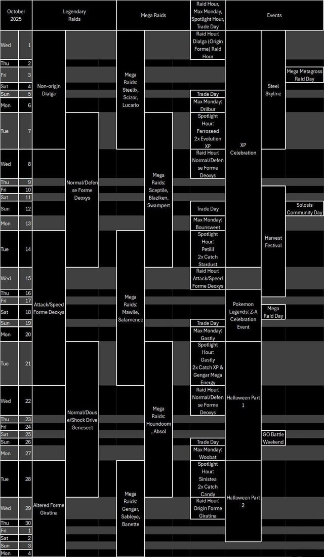
5. I get wanting to to a dark mode version but it looks like you’ve just inverted the graphic and it seems unreadable to me.
snarlinglol
Actionable advice: you have a hidden talent. Keep it hidden
WeedleLover2006
Actionable advice: If the mega raid day on the 18th is Mega Dragonite, I am buying Z-A and changing my profile
idriskitforabiscuit
Wrong day for mega metagross 👀
SugarP48
Ah yes, missingno. It’s been a while.
snowhomesh
Reading comments before opening your graphic, I was ready to open and pile on.
This is the first graphic that works for my brain. It’s easy to find a particular day, see it relative to other events in the month, and is kind on printer ink. It’s now on our refrigerator! Well done!
Your second version is easier to read. I hope you continue to make these, but if not, I’ll copy your format for our household.
15 Comments
[removed]
Actionable Advice: MY EYES! THE GOGGLES DO NOTHING!
Actionable advice: employees must wash hands before returning to work
Actionable advice: there’s a time and place for everything, but not now
It’s not pretty, but it is clear and easy to understand.
There are unnecessary gals to the right of some columns. That makes it look ugly and difficult to read.
Okay, see what I like about this is we can look for content gaps and predict where something might go
Actionable Advice: Just get on with your life and ignore Niantics Shenanigan-Schedules
completely unreadable
OK some actual advice:
1. Add padding to the cells, this makes text easier to read when it’s not stuck against a border.
2. The dark gray stripes make it look cluttered, and doesn’t make it easier to follow since they are broken up by the event blocks. Some thin gray horizontal lines might be a better option.
3. It could be simplified quite a bit by having one column for each raid type. You’ve implied they overlap for the whole day when they don’t. If possible split the cell so for example Dialga goes to a small way into Tuesday then Deoxys is immediately below, still starting in Tuesday.
4. Icons (Pokemon sprites) would help a bit for quick reference, and add a splash of colour.
5. I get wanting to to a dark mode version but it looks like you’ve just inverted the graphic and it seems unreadable to me.
Actionable advice: you have a hidden talent. Keep it hidden
Actionable advice: If the mega raid day on the 18th is Mega Dragonite, I am buying Z-A and changing my profile
Wrong day for mega metagross 👀
Ah yes, missingno. It’s been a while.
Reading comments before opening your graphic, I was ready to open and pile on.
This is the first graphic that works for my brain. It’s easy to find a particular day, see it relative to other events in the month, and is kind on printer ink. It’s now on our refrigerator! Well done!
Your second version is easier to read. I hope you continue to make these, but if not, I’ll copy your format for our household.