EDIT::::::
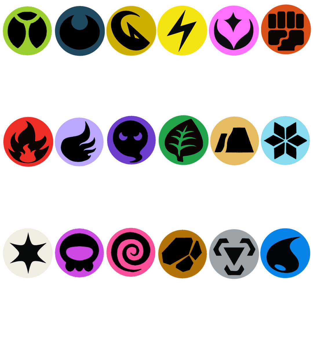
I MADE A NEW VERSION! If you want to use it for anything, >>>here is a higher quality version<<<
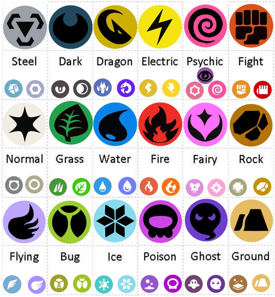
I think we can all agree that the Trading Card Game has the best Type Symbols. I wanted to make the current type symbols follow the same design philosophy as those, as an idea for what COULD HAVE BEEN!
I don't know why they refuse to use these superior TCG designs in the games – despite having used them in the anime of all things (which is what sparked this idea) and so I filled in the gaps by modifying the existing types to make them match.
As you can see below each type I made, I showed the other type symbols that are used for them as well, so you can compare them. On the Left is Scarlet/Violet symbols, and on the right is Pokemon GO & Sword/Shield symbols.
I'll to go over each of them:
TCG SYMBOLS:
Steel, Dark, Dragon, Electric, Fighting, Normal, Grass, Fire, Water and Fairy are all perfect. I just modified the colors a bit.
Psychic- I don't think the Eye is as good as the Pokemon GO's swirl, because I think the eye is a bit too literal. I know Grass has a leaf, and Fighting is a fist which juxtaposes the eye nicely, but I just think the eye is too much of a literal object.
I like that Fairy doesn't have a picture of an actual fairy, in the same way. It's just a symbol representing the type with shapes.
SWORD SHIELD SYMBOLS:
Bug- I removed the antennae, I think it looks better as a simple abstract shape more in line with the old TCG symbols. The antennae make it a bit too literal.
Flying- The modern symbols are all really rigid. So I made the shape more flowing and abstract to match the TCG style.
Ghost- I think Ghost is almost perfect. Maybe a bit too rounded, like a perfect circle (Even Dark in TCG is more of an oval), but basically fine. I just gave him a bit more of a wispy-tail, to better add to the flow of it, and make him a spooky lil guy.
Ground- I modified the line to be less boring and rigid, and be more abstract (You can notice the same detail in TCG's Fighting). I really hate the modern design philosophy of "boring straight lines".
Ice- Again, I made the lines less straight and even. Otherwise, this symbol is a really good abstract representation of the sharpness of ice, and loosely resembles a snowflake. I hate Scarlet/Violet's. It's so literally a snowflake and it sucks!
(I know TCG has a literal leaf and fist, again, but it's harder to represent "grass" or fighting" with just abstract shapes. Whereas ice, it's cold, sharp, hard, and I think you can use abstract shapes to represent those words; Metal type does this PERFECTLY, and has always been my favorite type symbol because of it).
Poison- I just made the circle in the middle less rigid. Poison now matches TCG's Water a bit more in this way (Imagine if TCG Water just had a circle in the middle of it, it would look so boring!)
Psychic- I think the spiral is a better, simpler shape than the eye. However a spiral like this could also represent Flying, so maybe this shape isn't the best to use. To me, the spiral represents the dizzying, confusing nature of Psychic attacks. I just think the Eye is too creepy and out of place.
Rock- Again I just made the lines more jagged rather than boring straight lines. But overall I like this shape – it's hard to separate rock and Ground, and I think because ground looks more flat, and rock looks more lumpy, it separates them better. (Whereas, without my addition to Rock, it also looks quite flat and looks basically like it could be ground as well)
Scarlet/Violet:
– I didn't use ANY of these because they SUCCCCK! (in my opinion)
Overall I think it's important for the symbols to be niche and individually identifiable, without the possibility of being used for a different type – grass is literally a leaf so it MUST be grass, etc..
Whereas, some of the abstract shapes they currently use fail this (What even is the current normal type symbol? A circle with two little "ears"? That could be literally ANY TYPE as every Pokemon can have ears!)
The issues I think mine still have are, Poison could also be bug, Ground could maybe be Rock, Psychic could be Flying, and Normal could be almost anything (but I think making it just a circle is way worse lol, besides the Colorless symbol is iconic, and to me it represents light, which of course when you think of white, you think of the Normal type. It also reflects the way the normal type "branches out" into every other type, as it's like the "basic type that can do anything" (Think Eevee)).
With the modern design philosophy, all the lines are straight, and the exact same width (whereas even Metal type's lines are NOT the same width if you look closely! Even the most rigid type still has some character to it).
It's very sterile and boring, and if there's one word you don't want to think of when playing Pokemon, it's "boring"! So I don't know why they made these decisions.
Anyway let me know what you think, do the modern type symbols make you cringe too?
by RestorerForer