Snom – Illustration Rare from Temporal Forces, released in 2024, and illustrated by N-DESIGN Inc.
That illustration credit is uncomfortable to write. At it's best a TCG is a celebration of the talent of individual artists, so it feels odd to credit a piece of art I do appreciate to a corporation – but Pokémon is a product, and it is the most financially successful franchise in the world, so corporate entities and identities are always going to be a part of this community. N-DESIGN Inc., is a VFX and CG Studio, and they tend to specialise in the graphic design of specific elements of the Pokémon TCG – they've illustrated a huge number of 'basic' V, ex, V-STAR, and V-MAX cards, and they've done a lot of textured full arts as well; they've also worked heavily on things like pack art and promotional tie in graphics. Clearly they do work in IR's as well, but that work is outnumbered by the sheer volume of VFX and CG graphic design they contribute to the TCG. Lower rarity cards can still be fun – and obviously they're an important staple of the actual game at the centre of all this, but they can feel a bit artistically boring compared with the atmospheric and environmental illustration rares. There are some fantastic full arts and basic V's and ex's (the full art Gengar Ultra Rare from T.F. is amazing), but a lot of them tend to miss the mark with me.
N-DESIGN Inc. tends to follow established rules of professional graphic design in their cards arts; individual Pokémon are typically framed around unseen lighting sources and backlit with flares and visual blooms to make the colour palettes seem artificially constructed. This also makes the silhouette of Pokémon 'pop' more and, in theory, makes them seem a lot more dramatic. In practise this often means framing Pokémon against monochromatic blocky backgrounds of pure colour, to make the outline of the Pokémon stand out more. Given that this is a very effective strategy of graphic design, I think it's why the TCG pack arts always seem to pop very effectively, but also why this style seems to fall down somewhat when translated onto a card, especially when held up next to the much more atmospheric illustration rares.
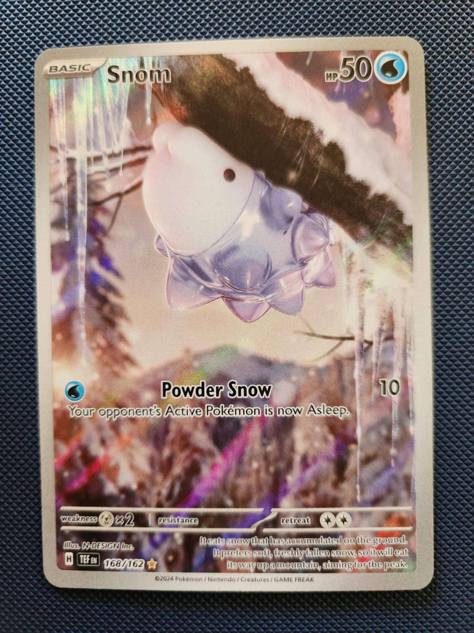
On the subject of illustration rares – obviously N-DESIGN Inc., does work on them, and it's interesting to see how this design philosophy plays out and, I think, works quite well in this different format. Snom is a very fun Pokémon (I stubbornly insisted on using Frosmoth for my entire first Sword and Shield playthrough, despite the fact that it kept being constantly obliterated). N-DESIGN Inc. has done a good job with Snom – their FVX design gives Snom a very fun translucence that runs through its body, with an internal light source that lights up the card art, and makes it seem like a very carefully framed photograph, as opposed to a digital piece of art. Compositionally, Snom is framed as small, but very close to us, surrounded by the negative space of it's environment – this environment works very well as the details are blurred (as if out of focus in a camera), which turns a weakness of digital design into a strength, and adds to the photo-surrealism of the card. While I don't like every card N-DESIGN Inc. has illustrated, I also recognize that they are given cards and rarities to illustrate that people aren't as artistically interested in – they've knocked it out of the park with Snom though.
Current market value: $7.70 AUD
by Galactic_Gandalf95