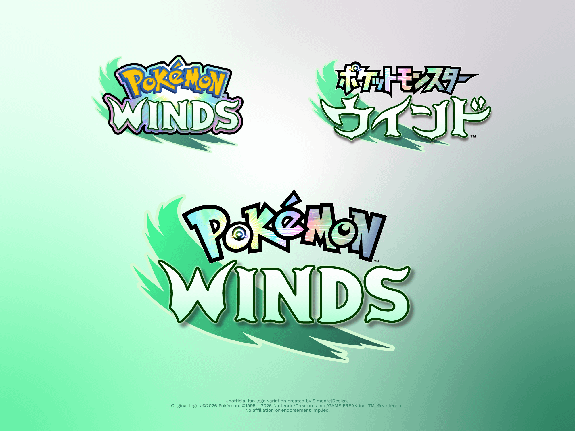
Hey there, I created this variation of the new Pokémon Winds logo. I know the official yellow/blue logo is way more instantly recognizable, but I was curious if that multicolored Japanese wordmark style could translate well to the English version.
It was definitely fun to experiment with, I'm sure they tried something like this as well and ultimately decided against it. It was especially tricky to integrate the new gimmick icon properly without making the classic "o" look odd. I'm guessing that's why they went with the rainbow glow as a background effect around the wordmarks in the official logos instead.
What do you think? Does this version work at all, or is the classic style unbeatable? Would love to hear your thoughts!
by SimonfelDesign