

-
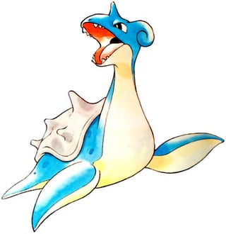
Give Lapras their teeth back. If that's just too scary then make them retractable like donkey Kong when you wanna show lapras's cute side.
-
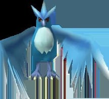
I liked articuno better when they were a slightly darker blue with bigger puples and irises. Looked more regal and bird like to me. Now it's eyes make it look kinda humanish. Bring back it's sparkle effect from snap too.
-
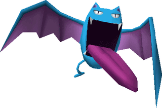
Bring back goalbat's tongue. It looks empty without it.
-
Torn on this one but I kinda vibe with dratini's stripes. Makes it synergize with dragonite a little better.
-
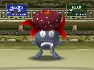
Outside of like cards, does gloom ever open it's eyes anymore? It's big shocked expression when in danger felt like a big aspect of it's design early on.
-
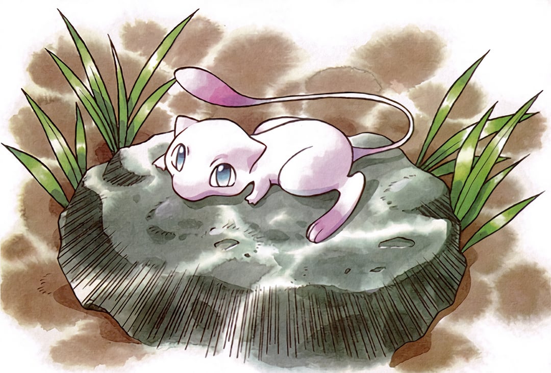
I liked mew better when he was so light pink that he was almost white but he had darker pink lowlights on his tail and toes. This design actually stuck around for a little longer than some of the others but it went away some time around gen 3. Boooo. Gen 1 has enough Peptobismol pink pokemon already. Plus aren't mew's hairs so fine you can see them on a microscope? I think that if he's got white coloring it's like he's kinda like holographic. If he's pink it's like you can see through the hair and the pink is actually us looking at his gross cat skin through his fur? Ewwww. Jk. But still. Change it back.
by Jojo-Action