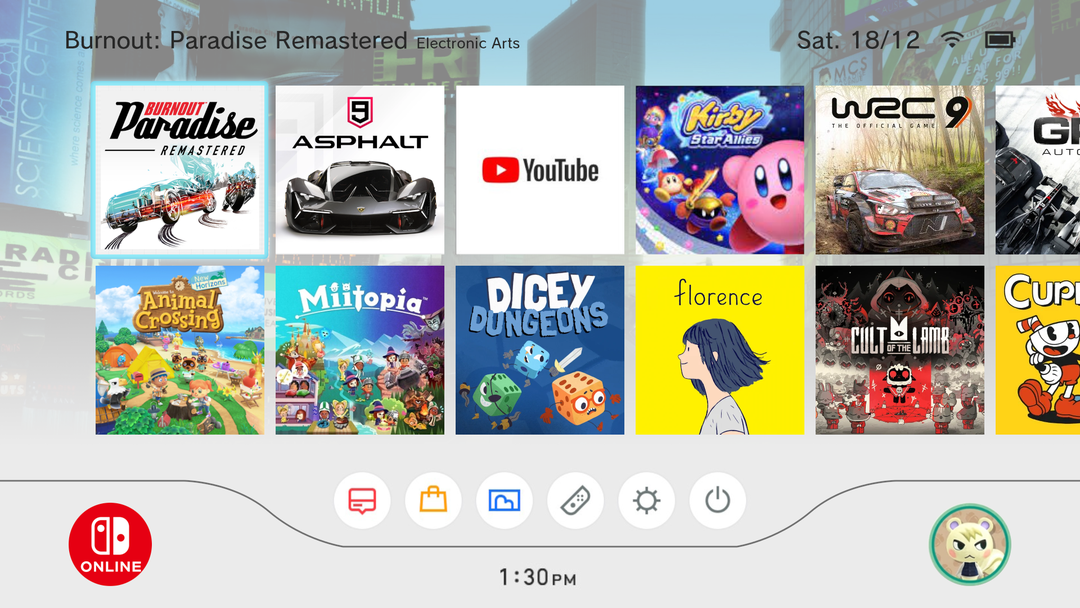
Nintendo Switch menu redesign. Bonus points for those who recognize what Nintendo menu it’s based on.
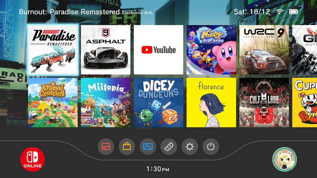
Nintendo Switch menu redesign. Bonus points for those who recognize what Nintendo menu it’s based on.
by DenpasOfTheWorld
41 Comments
LesKillDaHoeBeetch
Wii
jswitch77
The one thing I missed about the old menus (especially the Wii u) is that relaxing ambience sound in the background.
Cybergheist
I love this.
The standard switch menu looks so dang lifeless and without character, this is so much better!!
Gareatron
I want this badly
OoTgoated
Smooth. Love it.
Atlanticae
I still think this lacks the charm of the Wii/3ds era. Those dashboards were so ‘friendly’, I really miss them (in addition to all the social apps like street pass. God I miss street pass). I would prefer more rounded edges.
Ps – Is there a subreddit for speculative designs like these?
BizarreTown1999
I bought a ps4 a couple months ago to play a few exclusives and the dynamic themes are so fun to look at, wish Nintendo gave us at least a custom wallpaper option to set a screenshot as the background or something, literally the bare minimum
jonsbryhill
hell ya dicey dungeons
Destian_
Now that is a fancy mockup. Only concern would be having multiple users on a system.
Would you have to select a user before you land on the homescreen or would the icons downscale based on how many users there are?
ThomasAlban307
I like the fact that this redesign holds some nostalgia from the wii menu but also feels modern and in line with switch branding
Ranger-Vermilion
I saw the bottom bar and instantly heard Wii sounds
MoonieSarito
I love the Switch, but its menu really fails to convey the “Nintendo Magic” that the Wii U, 3DS and Wii menus conveyed to me, it’s just looks flat and boring.
To this day I still don’t understand why Nintendo didn’t add themes like they did on the 3DS, they would only gain from it as they could earn extra money easily.
OMGWTF012
The wii background it always used to show you what you are currently plating so my guess is the wii background
emubilly
Better than most of the ones I’ve seen on this sub. Not cluttered or overly designed
PartyGod007
Reminds me of the Wii
blappit3003
I just wish there was a dedicated Mii Maker button.
itsastart_to
Looks great!
LuigiTheHedgehog
Pros. I like the design of Wii:)
Cons. I don’t like that instead of themes, there will be game specifc wallpapers.
Overall its a nice redesign. But custom themes (3DS style) would be better imo.
modssssss293j
Wii, classic menu
hollowpotato-of-doom
They need to add more backgrounds
Original_Ys
Wii
Prophet6000
This is fire.
LC_Animations
I was guessing Wii at first glance.
hello_im_some_one
I think is based on the wii menu
ProudStudio8243
This is based on the original wii menu
Robottsie
I like how you keep the simple feeling the og is going for while making it more interesting, although I do want to suggest that the user icon should either stay the same as the og or be closer to the left because it would be better for an important feature that you’re likely to use often to be only a few inputs away rather than on the opposite side of the screen.
_SlikNik_
How’s burnout paradise?
SimonCucho
And this is why companies hire several professionals to work on thins like this :)))
TheOffiicialTOY
Bless you for choosing Burnout Paradise Remastered and not the usual Nintendo stuff.
PayneTrain181999
Burnout Paradise right there, amazing game.
MrEmptySet
I see that you based this on the menu from that obscure cult classic Nintendo console, the “Wii” – what a deep cut!
dekuweku
It’s the Wii. i like it.
vr1252
I feel like we enjoy this because we’re old and kids would hate it lol.
Cautious-Affect7907
Wishful thinking, but maybe for the five year anniversary we can finally get themes at least.
arrowkid111
Im saying Wii
Evilcon21
Wii. That brings back memories of the wii
MatchaVeritech
I miss the Wii U main menu music…
Jumpyer
Wii U/3DS were peak Nintendo OS and we’re never getting that back 🙁
I loved the ambience music, the Easter eggs (remember when it was your birthday on Wii U or when you blew on 3DS mic while an app was selected?)…
daisiesintheskye
I think it would hurt my brain of I was flipping through games on my switch and the background was constantly changing
Its_D_youtube
“bonus points if you know the most famous system UI in existence”
41 Comments
Wii
The one thing I missed about the old menus (especially the Wii u) is that relaxing ambience sound in the background.
I love this.
The standard switch menu looks so dang lifeless and without character, this is so much better!!
I want this badly
Smooth. Love it.
I still think this lacks the charm of the Wii/3ds era. Those dashboards were so ‘friendly’, I really miss them (in addition to all the social apps like street pass. God I miss street pass). I would prefer more rounded edges.
Ps – Is there a subreddit for speculative designs like these?
I bought a ps4 a couple months ago to play a few exclusives and the dynamic themes are so fun to look at, wish Nintendo gave us at least a custom wallpaper option to set a screenshot as the background or something, literally the bare minimum
hell ya dicey dungeons
Now that is a fancy mockup. Only concern would be having multiple users on a system.
Would you have to select a user before you land on the homescreen or would the icons downscale based on how many users there are?
I like the fact that this redesign holds some nostalgia from the wii menu but also feels modern and in line with switch branding
I saw the bottom bar and instantly heard Wii sounds
I love the Switch, but its menu really fails to convey the “Nintendo Magic” that the Wii U, 3DS and Wii menus conveyed to me, it’s just looks flat and boring.
To this day I still don’t understand why Nintendo didn’t add themes like they did on the 3DS, they would only gain from it as they could earn extra money easily.
The wii background it always used to show you what you are currently plating so my guess is the wii background
Better than most of the ones I’ve seen on this sub. Not cluttered or overly designed
Reminds me of the Wii
I just wish there was a dedicated Mii Maker button.
Looks great!
Pros. I like the design of Wii:)
Cons. I don’t like that instead of themes, there will be game specifc wallpapers.
Overall its a nice redesign. But custom themes (3DS style) would be better imo.
Wii, classic menu
They need to add more backgrounds
Wii
This is fire.
I was guessing Wii at first glance.
I think is based on the wii menu
This is based on the original wii menu
I like how you keep the simple feeling the og is going for while making it more interesting, although I do want to suggest that the user icon should either stay the same as the og or be closer to the left because it would be better for an important feature that you’re likely to use often to be only a few inputs away rather than on the opposite side of the screen.
How’s burnout paradise?
And this is why companies hire several professionals to work on thins like this :)))
Bless you for choosing Burnout Paradise Remastered and not the usual Nintendo stuff.
Burnout Paradise right there, amazing game.
I see that you based this on the menu from that obscure cult classic Nintendo console, the “Wii” – what a deep cut!
It’s the Wii. i like it.
I feel like we enjoy this because we’re old and kids would hate it lol.
Wishful thinking, but maybe for the five year anniversary we can finally get themes at least.
Im saying Wii
Wii. That brings back memories of the wii
I miss the Wii U main menu music…
Wii U/3DS were peak Nintendo OS and we’re never getting that back 🙁
I loved the ambience music, the Easter eggs (remember when it was your birthday on Wii U or when you blew on 3DS mic while an app was selected?)…
I think it would hurt my brain of I was flipping through games on my switch and the background was constantly changing
“bonus points if you know the most famous system UI in existence”
Here we go again…