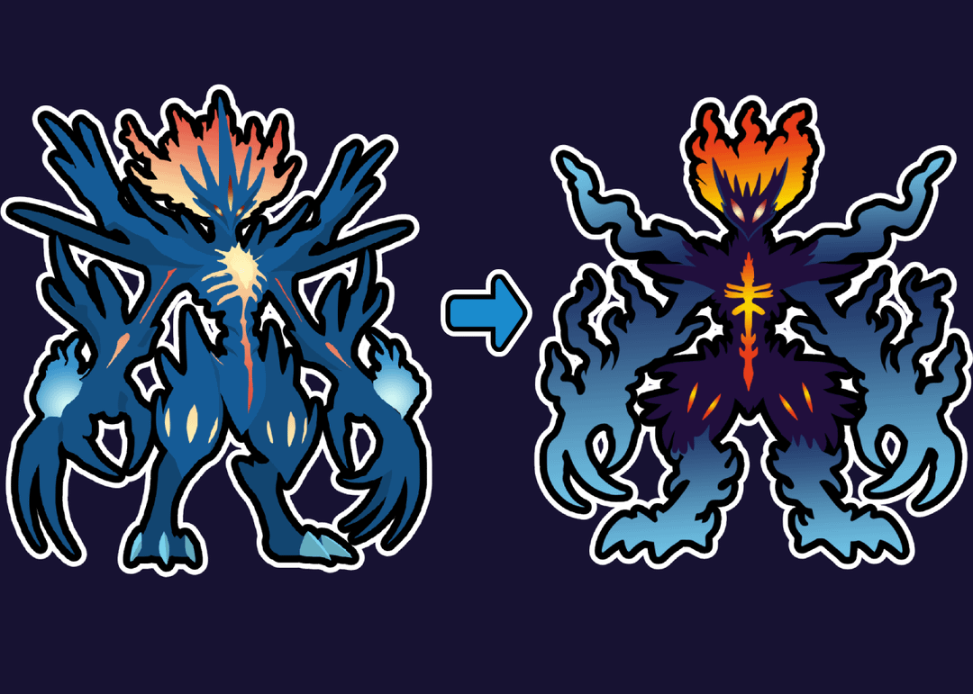
Okay guys, I received a lot of comments from the last post that my final evo doesn’t look like pokemon and is over detailed. I decided to re-draw it. Here is the new version. What do you think? Does it fit better into the evolution line?
by FarWait2431
27 Comments
I like both of these they look amazing. but they both look great. Who cares if they look like pokemon there are some pokemon that don’t look like pokemon after all. Do your own thing haha.
I’ve said it before, and I’ll say it again. That’s a digimon.
Idk what those people before were smoking. The 1st version is great. Have they never seen Eternatus??? The new version looks like a sticker for the 1st version.
The shapes are still quite complex and overdesigned, and if I’m being honest, I like the overall shape and color scheme of the original – more interesting imo. And both still kinda look like ultra beasts, the former especially.
Try simplifying the design to a point where even a five year old could draw the basic shapes (not just the silhouette, but also any design markings). If I can’t tell what you’ve drawn from a shitty toddler’s drawing, it’s hard to call it a terrestrial pokemon. If your intention was to make a pokemon that’s not of this world in one way or another, then you had already achieved that with your original design. If you want it to be something I might find while walking around the region and without some weird space time alien abduction spirited away bullshit happening, then cut back your design even further.
Still awesome, still not a Pokémon
It’s still too edgy and over-designed to be a Pokémon imo. Fits Digimon perfectly though!
I can’t quite put it into words but there’s something “friendly” about Pokémon designs that this just doesn’t have. Even the strong legendary Pokemon (with the exception of like, Eternatus?) have an approachable, “cute” quality about them. This just doesn’t have that. That doesn’t make it a bad design, it’s just not Pokémon-like. I’ll say it again though, this goes hard as a Digimon!
Original one would be an incredible legendary design imo
Actually though if this was one of the box legendaries for like gen 10 I would lose my shit
Actually
For some reason I could see this being like a 100% forme of xerneas
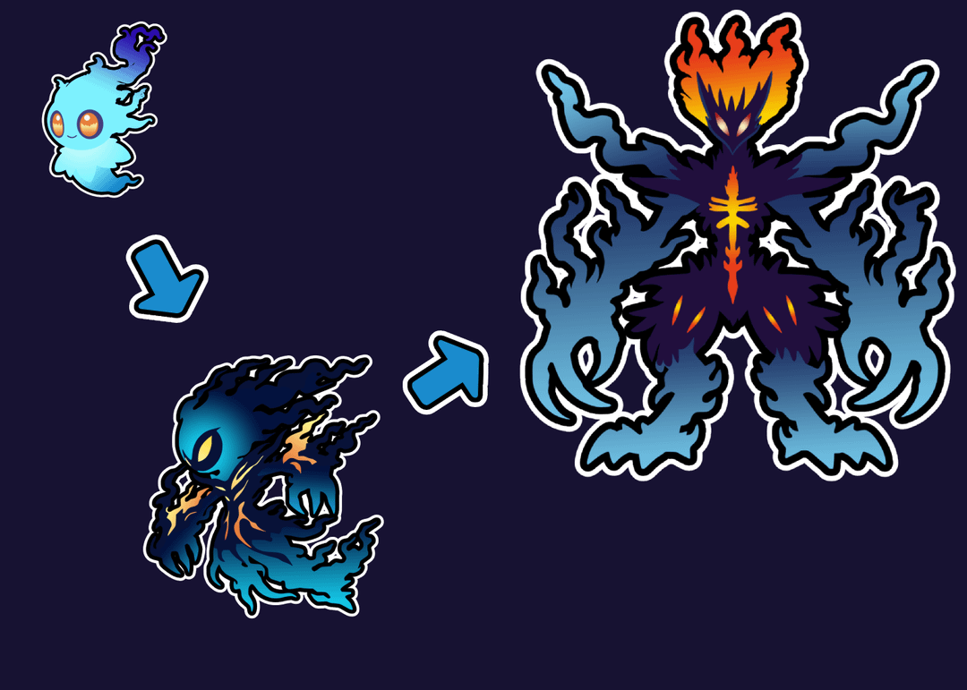
The are awesome designs however they still are too much. But it was not your color pallet that is failing you. It’s the shape. The main shapes of your body is good but the flame / smoke shape is completely overboard. Look at charizards flame for example, most of his artwork has their tail flames having like 3 prongs of fire. That is as complex as it should be. Meanwhile your’s has like 6 prongs of fire per spot. Your evolution designs have the concept right though in its advancements such as the second form getting claws, longer body, and a larger head. Then your third form gaining legs and a core. That is all perfectly good. But it’s being brought down by the overwhelming shape of the Flames and smoke.
Why is he doing the “hey bro look at my leg”
It may not be a Pokémon that you catch on route one… but it definitely fits in with the solgaleo / lunala evolution lines.
I love that you’re going for something badass. I do think that defining the final evo’s height and smoothing out its edges would make it look more like a Pokémon you could catch somewhere along the journey.
It looks like it could be absolutely massive, and the dark / spiky design makes it look more intimidating than friendly.
I could see this as a legendary or pseudo legendary. Given that we have the Cosmos line which is an evolving ub/legendary I’m curious if we would see something similar again
Honestly I think it’d make a banging digimon line
I prefer the first one, it looks like some sort of legendary
I swear this guy’s from Ben 10.
You really dont need that much forms to shell the concept in a good pokemon design, look at the shapes of other pseudolegendaries, salamence’s wings are made of paper and he is stil cool, goodra is full round shapes, the most complex of them is probably Kommo-o and even him is allready a bit overdesigned for my liking
Honestly in both cases this looks like an SMT demon. And I am a-ok with that!
Oh cool digimon
Reminds me of that giant humanoid Heartless from Kingdom Hearts. The first version’s colours worked better IMO. This would fit really well as a final form for a boss legendary. Think Ultra Necrozma or Eternamax Eternatus
I LOVE this, although it reminds me more of Digimon, that’s not a bad thing at all (I like Digimon more) but good job over all!
You didn’t simplify the design, it looks like you just re-drew it with flatter colors and recolored the core, it’s a cool design but neither look pokemon-y at all
There’s just too much going on. 1st evolution is absolutely fine but 2nd and 3rd just don’t look like pokemon.
You downgraded it…
Reuse the old version as the Mega 😜
Nah, the first version was fine
This looks amazing; however, it looks more like a digimon than a Pokémon/fakemon
looks like a legendary to me, like an ultra beast
Love both designs! The original(and even the current one) look like they could be ultra beats if they didn’t have the pre evo!