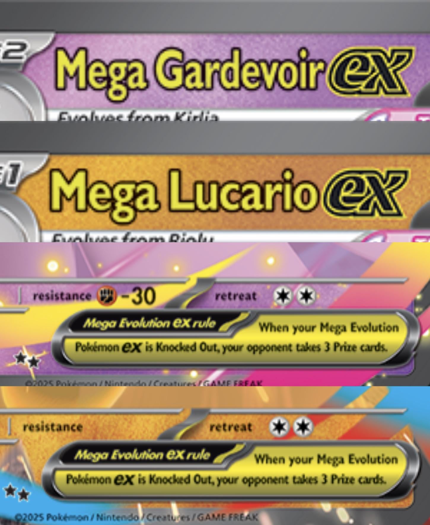
Never occurred to me that the color on the Pokémon name and the rule box could make such a difference to my sense of aesthetic, but fr I don’t think it looks good. Specially thinking of some background colors and how they interact. In some bg it looks ok, in some it makes no sense and just looks bad. I’m super excited for this comeback, but I can’t wait for the illustration and full art cards, those could make things look way better for me. What do you think of this choice?
by GUROMETAL
1 Comment
I mean, these are just 2D images, on the actual cards they’ll almost certainly be foiled gold like the og megas which imo have never had any aesthetic issues due to colours