Mostly wondering about the proportions and if they suit a first stage starter. (Still in the sketching phase btw)
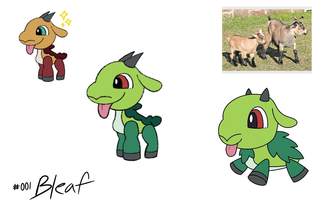
Bleaf, a pure grass type and the first stage grass starter in the Scandia region. It is based on a coastal goat and as its later evolutions will take inspiration from heidrun, the mead-producing goat from Norse mythology.
The shiny form is based on the Norway pine, also known as red pine, hence the red coloring.
by AmpharosGuy009
8 Comments
Like it a lot, but his nose looks like an odd mustache
I think it looks pretty good! The old design might have been a bit too chubby to walk well, the legs give more floppy plushie vibes rather than strong goat legs.
Though the new design could be a bit too thin? If you wanted you could give it a little bit more of a baby belly. I like the colors and the face a lot!
Decent
Some pink other from the tongue would make it pop nicely. Maybe small flower buds on the back?
I really like this design and the inspiration! Out of curiosity, are you going to give its evolutions a secondary typing? I’m imagining a poison type with some sort of intoxicating move/ability which could effect the opponent’s accuracy (essentially, they get drunk and can’t aim lol)
I agree with the other comment about the baby belly, give it a bit more roundness going from the chest to the back leg imo.
Also, could consider separating the horns a bit like in the old concept, since the nose is almost facing towards us. And, just as a try maybe, look at goat eyes and see if making them similar would work with your design maybe?
Overall big improvement imo.
Awww
The form is definitely improved, nice job.
My main feedback is going to be colors – namely, I think your palette is too large, especially for a stage 1 starter. Most starters are 3-4 colors, *maybe* 5: A primary, 1-2 secondary colors, and 1-2 accent colors.
You have 7 colors in your palette, not including white/black for the eyes. I sometimes give tongues a pass, but its a clear design feature in your case, so its color definitely counts. And virtually none of your colors appear more than once, making them all feel like competing accents.
Possible options include:
* Unify your dark greens, much like your first design. I think this would be my main advice. If you think the dark green ends up taking up too much space, you could push the light green down onto the thighs, much like how the reference image has the brown go down to the knees. Experiment a bit.
* Change Eye color. Bold, vibrant eyes tend to work well when the colors are otherwise simple (Sprigatito, Froakie, Litten) or when they tie into other design elements (Totodile, Fenniken, Turtwig).
* Remove Underbelly color. Your design is full enough that I don’t think you need to break up the body with a new color. And if you want to fill a little space there, I quite liked the little chest tuft you had in your first design. Reminds me of a cute little goat beard.