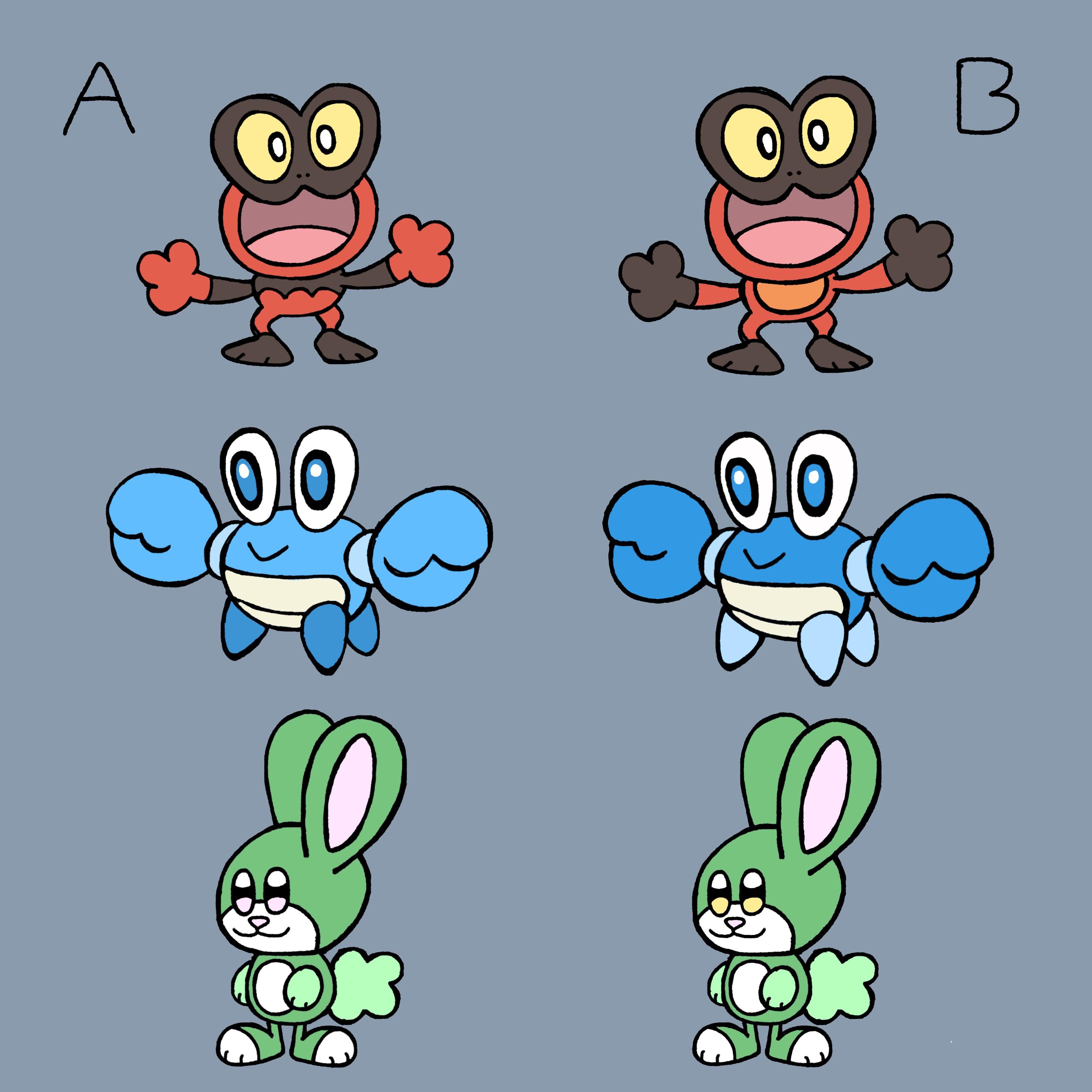
Hey everyone! Thank you for all of the feedback on my starter post from last week. I tried to rework and take everyone’s votes and comments into consideration. So here are the new final 2 designs for each one, oh and ended up redesigning the rabbit lol
by WaterHazard23
40 Comments
B, A, Neither.
That rabbit doesn’t work. It looks like it’s from a completely unrelated cartoon world with a more anthropomorphic style. I also cannot tell the difference between them?
B, B, A for me
Tho I do kinda second the comment of u/BallerBettas.
Theese arent fakemon/pokemon i see a green rabit a red frog and a blue crustation
They are cute bit they are just regula animals
Have you made the final stages yet? Make them first tgey will always be the most uniq.
Theres alot of pokemon first stages that are just animals but they usualy have somthing that make them “not just a normal animal”
As across the board
Either leaning towards A, B, Neither, the rabbit does not look like a pokemon
BBB
A, A, B
B
Looked back and your original design for the grass bunny looks better in that it accentuates the grass type of the mon in its bush tail–this design doesn’t do that and makes it look more like a green cartoon rabbit. Same goes for the frog. I’d focus more on emphasizing type-based features thst evolve with the line instead of these small color shifts
B, B, Neither
B
A
A
All A, but I think the fire frog’s “pants” (the area between its chest and feet) should be the orange from its B form to break up the color a little.
A, A, None
Frog B, crab A, bunny B
A,A,B
B for all 3
All B
A, B, couldn’t see a difference in the third one
A on all
Bx3
A A B
A, A, B
I would commit war crimes for the frog on the b side
B
A, B, B
Bba
#A, A, B
B, A, A
These are great! My feedback is give them evolutions
A for all three
A. B. A.
A,A,B if I really had to choose but maybe add a few leaves on the third one
B B B
B, A, B
I like the fire one, not sure if you’re going for it but it’s a little muppet-y with the proportions. I almost say lean into it and have Elmo as a fire type.
I love the crab! A is better imo because B looks like Wailmer
The rabbit looks great, I think the yellow eyes help distinguish the face from being too monochrome. When it’s all the same color the eyes just move right past it, there needs to be just a splash of a lesser used color to make it interesting. (And once I saw the yellow eyes, the pink ones played tricks on me and turned yellow. felt like that meme from the office with the identical pictures)
Nice
B, A, A
All column A.
Unsure what’s even different with the rabbits.
I recognize that crab mon, it’s one made by someone else, and it’s quite literally the exact same thing, especially the A version, which is 1 to 1.
B
I adore them all. They’re so cute.