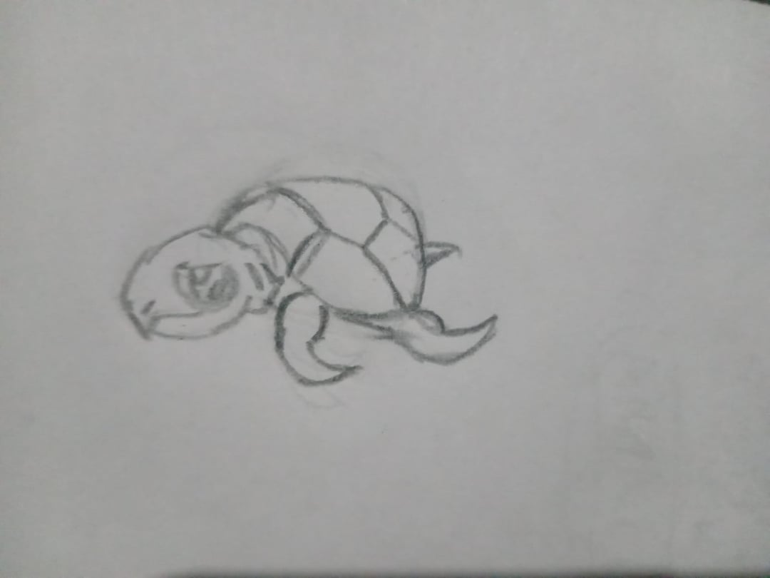
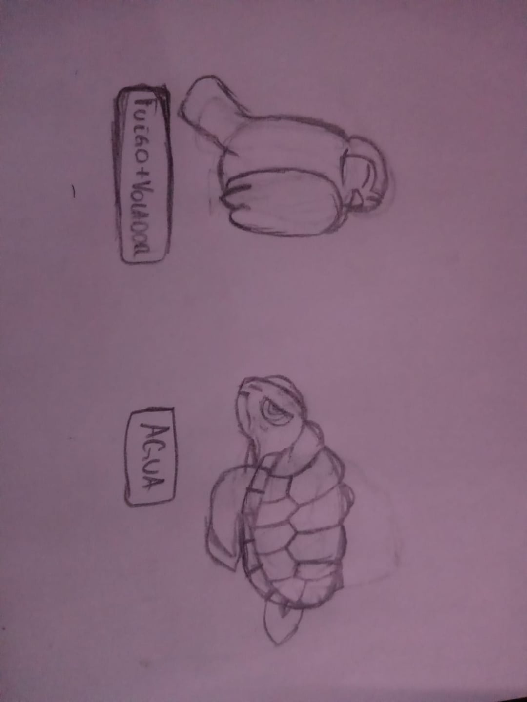
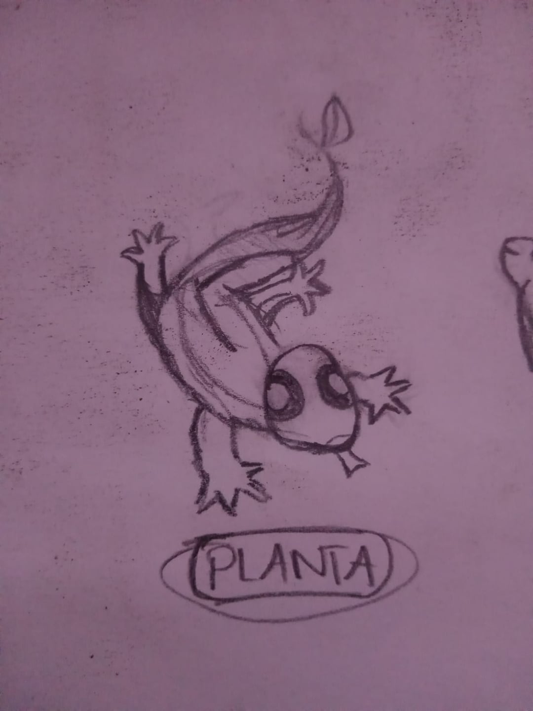
I made a few desings of a starters (The turtle is Water, the owl is Fire, and the lizard is Grass), but i feel like i need to practice more the artstyle of the franchise.
What tip could you give me to improve not only this desings, but all my Pokemon Art Style?
by ShiningLightShadow
3 Comments
Me gusta la tortuga
trying seeing more pokemon arts, details, and for first stages, you can try to make them cute and simplify their shapes, like giving a big head and tiny body. Try seeing more about concepts for the mon, for example Samurott, is based on otters, samurai and shoguns, with the concepts that you want to bring to the mon you will get more details for it that will make it look more pokemon, and be careful for not doing so complex details 🙂
First tip, make sure you have more of a solidified concept. These just look like real world animals but with a few changes. Like a lizard with a leaf on its tail. Take time to research and decide on a concept.
Think about what you want the personality of your Pokemon to be like. Are they timid, mischievous, jolly, aggressive? Then use their facial expressions, poses, and eyes to portray that personality. For example: Salazzle has very sleek, narrow, eyes with a confident, upturned smile. And her eyes have an eyeliner look to imply a sense of sexiness which calls to her role as the leader of a reverse harem. Dark type and poison type Pokemon imo are the best example of this. They often have narrow, droopy, or hemisphere shaped eyes to portray their mischievous, scheming, carefree, or rebellious attitudes. The eyes for your turtles are pretty good in that regard, so good job on that.
Typing is part of the concept as well. Why is your Pokemon the type(s) that it is? How is it relevant to how it exists within its natural habitat. Regional variants embody this perfectly, as their environment affects their typing and appearance.
Second, study the shapes and proportions of official Pokemon. This is a pretty basic concept for all forms of art, but everything can be reduced to basic shapes. Like triangles, circles, squares, cylinders, etc. For example, let’s say you want to draw cryogonal, first you start by drawing a large hexagon, that way you can have the proportions laid out before you actually begin adding the details. Start with the big shapes first, that’s your foundation. That will help you make sure all of the details are evenly proportioned. Shapes can help solidify a concept as well. Should your Pokemon be more round or sharp? For example, Turtonator is very jagged and angular which helps it’s design as the land mine turtle. The outward facing spikes elude to an explosion (💥).
Shapes are also important when portraying its typing. The turtle doesn’t portray water type beyond being a turtle, the lizard doesn’t portray being a grass type beyond having a leaf on the tail, and the fire type doesn’t portray that it’s a fire type at all. Or course colors can go a long way in that sense but it’s not necessary if the details imply it.
Pokemon tend to have exaggerated proportions to help draw attention to the focal point. For basic pokemon, usually the head and one other major detail are enlarged. A good example is fennekin. It has a large head and slightly smaller tail. The head (in particular the ears) immediately draw your attention as the largest feature, and you’re then naturally drawn to the tail, then the flare on the back legs, then the front legs in a sort of crescent shape. The pose in the official render helps your eyes naturally follow the most important details rather than the relatively plain front legs by tilting its head towards its tail, away from the front legs. This part takes a lot of practice, I’m still not great at it. Dynamic poses are difficult, so don’t worry if it takes you a while to get that down, but they can also help portray personality so it’s worth working on.
Third, if you want to aim for a particular gen’s design philosophy, study specifically that gen. What similarities are there within that gen? Each gen is slightly different than the last. Gen 1 has very triangular eyes with small pupils (primeape or dodrio) or round eyes that are one color with a highlight (vulpix or sandslash) and more realistic proportions with fairly uncomplicated (onix or geodude) and more stoic (nidoran families) designs. Whereas gen 9 has very complex designs with more intricate details (ceruledge or koraidon) and very expressive faces (cetoddle or tinkaton).
Fourth, since you’re drawing on paper rather than digital, practice doing rough drafts and drawing the basic shapes very lightly so it’s easy to erase without being visible afterwards. With each layer of detail, draw just a tiny bit harder until you’re ready for the final product. That’ll help you have a better base for the finished result. Don’t be afraid to use a whole page just to flush out one Pokemon. Draw it in different poses, with different facial expressions. It can really help you to flush out the concept. Use references too. It really helps to have a real world example. Over time you’ll figure out which details can be removed and what can be exaggerated to make a real thing look like a pokemon.
Lastly, don’t over-design. Too many details make a Pokemon look cluttered and the intention gets lost in the execution. I can’t overstate how important it is to take the time to study official Pokemon. It can even help to just copy official renders for a while to help deconstruct and better understand how they’re made. Take an official render, start with the big shapes, then the small shapes, then solidify the shapes and start adding details. Trial and error is your best friend.
It’s okay to focus on one of these at a time. In fact I’d recommend that. Don’t overwhelm yourself and try to get good fast. You’ve got time, so practice. Fail and try again over and over until you get it right. The best way to get better at drawing is to simply keep drawing. I also recommend, if you’re able, to watch YouTubers like Sterninator, Subjectively, and TrueGreen7 as they do a great job at explaining their creative process. TrueGreen7 particularly is a good source for learning how to improve. Although out of the three, his style is the furthest from the official Pokemon renders, he does videos where him and other fakemon artists do competitions where they judge fanmade fakemon and give feedback about what can be improved.
Sorry for writing so much, I tried to be as detailed as I could with my explanations. Hopefully this helps! Keep in mind, I’m still learning too, I’m far from my art looking official, so I’m not an expert, but I think it’s good to know what to work on so you have a plan for growth.